
The mistake that costs you a full round of rework
The most expensive mistake I see with Amazon A+ Content has nothing to do with copy or photography. It happens before any of that: a seller or designer builds every image on one big canvas — usually 970 × 600, because that is the size they found first — and then discovers at upload that A+ Content does not work that way.
A+ Content is per-module. Every module type has its own image size. Design to the wrong canvas and you get cropped headlines, blurry rescaling, stretched product shots, and a full round of rework right when you wanted to launch.
This guide gives you every Amazon A+ Content image size I design to, for Basic and Premium, plus the file requirements, the places where even good guides disagree (I flag those honestly instead of picking a number silently), and the separate rules for listing images — because listing images and A+ images are not the same spec, and mixing them up is the second most expensive mistake.
A quick note before the tables: the A+ Content Manager in Seller Central shows the exact dimension for each module at the moment you add it. Treat the tables below as your design brief, and the builder as your final check. If the two ever disagree, the builder wins.
The Short Answer: A+ Sizes at a Glance
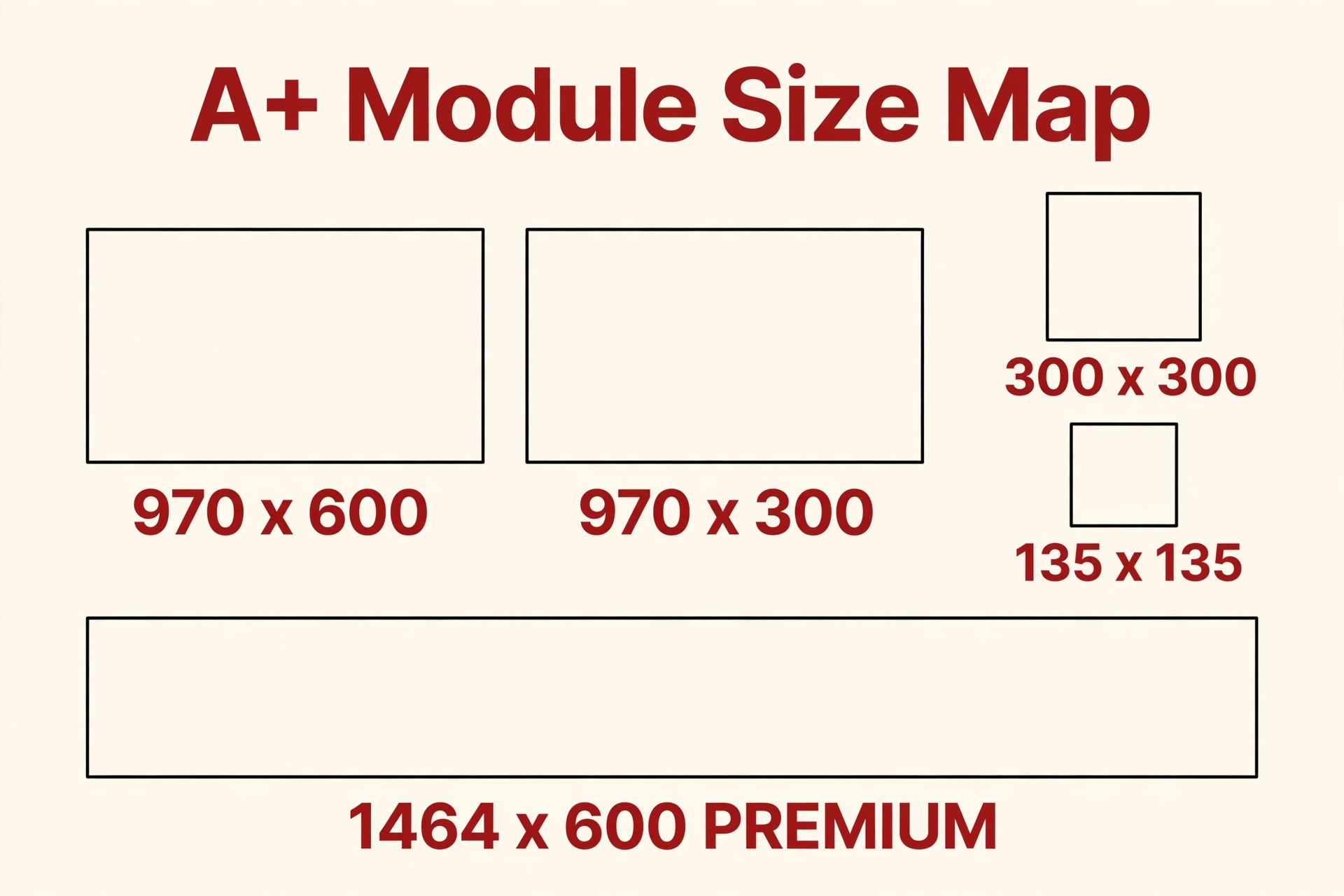
If you only take five numbers from this article, take these:
- Hero header (Basic): 970 × 600 px
- Full-width overlay banner (Basic): 970 × 300 px
- The workhorse square (Basic): 300 × 300 px — it appears in more modules than any other size
- Company logo: 600 × 180 px
- Premium full-width image: 1,464 × 600 px
Everything else is a variation on those shapes. Now the full tables.
Basic A+ Content Image Sizes: The Complete Table
Basic A+ Content lets you add up to five modules per product, chosen from a library of 14 module types. It is available to sellers enrolled in Amazon Brand Registry with a Professional selling plan. Here is the size for every image-bearing module:
| Module | Image size (px) | Notes |
|---|---|---|
| Standard Company Logo | 600 × 180 | Logo only. No tagline, no extra text. |
| Standard Image Header with Text | 970 × 600 | Your hero. Keep key content out of the bottom overlay zone (see below). |
| Standard Image & Text Overlay (light/dark) | 970 × 300 | Wide banner. The text overlay sits on the image, so design for contrast. |
| Standard Single Image (left/right) & Text | 300 × 300 | One square image beside text. |
| Standard Single Image & Highlights | 300 × 300 | Square image with a short highlight list. |
| Standard Single Image & Spec Details | 300 × 300 | Square image beside specifications. |
| Standard Three Images & Text | 300 × 300 each | Three squares. On mobile they stack vertically, so order matters. |
| Standard Four Images & Text | 220 × 220 each | Four in a row. Small canvas — one idea per image. See the honesty note below. |
| Standard Four Image & Text Quadrant | 135 × 135 each | The smallest canvas in Basic A+. Icons and tight crops only. |
| Standard Single Image & Sidebar — main image | 300 × 400 | Portrait orientation. See the sidebar note below. |
| Standard Single Image & Sidebar — sidebar image | 300 × 175 (verify in builder) | Sources disagree on this one; details below. |
| Standard Comparison Chart | 150 × 300 per product | Portrait product shots. Design for up to five products side by side. |
| Standard Product Description Text | No image | Text only. |
| Standard Technical Specifications | No image | Text/table only. |
Three practical points from my own design work:
Design at the exact size, then check at mobile size. A 300 × 300 module looks generous on a desktop monitor. On a phone it is a postage stamp. If you bake text into these small images, keep it to a few large words — or better, put the words in the module’s text fields, where Amazon keeps them readable and searchable.
The 970 × 600 header has a danger zone. In the Image Header with Text module, Amazon places your headline text over the lower part of the image. Keep faces, product details, and anything important out of that bottom band, or your own headline will cover the thing you wanted to show.
The quadrant modules punish clutter. At 135 × 135 and 220 × 220, there is no room for paragraphs, badges, and three callouts at once. One clean visual per cell. If a cell needs a sentence to make sense, it belongs in a bigger module.
Where the Guides Disagree — Read This Before You Brief a Designer
I cross-checked multiple current guides while preparing this article, and three figures genuinely conflict. I would rather show you the conflict than print a false certainty:
- Four Images & Text: most guides list 220 × 220 px per image; at least one lists 220 × 200. I design to 220 × 220 and confirm in the builder before exporting finals.
- Single Image & Sidebar — sidebar image: sources split between 300 × 175 and 350 × 175. The main image (300 × 400) is consistent everywhere. For the sidebar, check the upload prompt for your exact module before you export.
- Comparison chart: seller guides consistently list 150 × 300 px per product image. I use that. If you ever see 150 × 150 quoted, it does not match the seller-facing guides I trust.
The lesson is not that the tables are useless — the core sizes above are stable and consistent. The lesson is that “check Seller Central’s current requirements” is not boilerplate. Amazon adjusts modules over time, and the builder is the only source that is guaranteed current for your account.
Premium A+ Content Image Sizes
Premium A+ Content raises the ceiling: up to seven modules from a larger library of 19 module types, including video modules, interactive hotspots, carousels, enhanced comparison charts, and a Q&A module.
| Premium element | Image size (px) | Notes |
|---|---|---|
| Premium Full-Width Image | 1,464 × 600 | The signature Premium canvas — noticeably wider than Basic’s 970 px. |
| Premium Image Header / hero modules | 1,464 × 600 class | Design Premium heroes at full width; confirm each module in the builder. |
| Video modules | Video file, not a still | Follow the video specs shown in the builder for your module; keep videos short and product-focused. |
| Interactive hotspot / carousel modules | Varies by module | Hotspot and carousel image sizes are shown per module at upload — verify before export. |
Eligibility, stated carefully: Premium access is not automatic with Brand Registry. Amazon’s published guidance ties it to having a published Brand Story across your catalogue and a track record of approved A+ projects in the past 12 months — you will still see older guides quoting different thresholds, including an outdated “15 ASINs” figure. Do not plan around any threshold you read on a blog, including this one. Check the Premium eligibility page in Seller Central for what applies to your brand today.
Is Premium worth designing for? Amazon reports that Basic A+ Content can lift sales by up to around 8%, and Premium by up to around 20%. Those are Amazon’s own figures, not mine, and they are ceilings, not promises — your result depends on your category, traffic, and design quality. My honest take: if you are eligible, the wider 1,464 px canvas and video are worth using on your hero products first. If you are not eligible yet, good Basic A+ built at the right sizes beats mediocre Premium every time.

That excerpt is cut from a full A+ stack I designed for a fishing cast net. The full stack file is 1,464 px wide from top to bottom — exactly the Premium standard — which is why it stays sharp as a wide hero. When a file is built at the wrong width and stretched to fit, this is the sharpness you lose.
A+ File Requirements (Beyond Size)
Size is only half the spec. These are the file-level requirements I check on every project:
- Format: JPG or PNG only for A+ images.
- File size: maximum 2 MB per image. Export with quality in mind — a well-compressed JPG at the exact module size should come in well under the limit. If your file is over 2 MB, reduce dimensions to the exact spec first (oversized files are the usual cause), then adjust quality.
- Alt text: every A+ image has an alt-text field (image keywords). Write a plain, accurate description of what the image shows, using relevant terms naturally. It supports accessibility and helps Amazon understand the module. Never stuff it with repeated keywords.
- Colour and quality: upload clean, high-resolution source at the exact module dimensions. Amazon will scale for display; starting below the spec guarantees a soft result, especially the 1,464 px Premium modules on large screens.
- No borrowed listing files: do not reuse your gallery images as A+ modules without re-exporting at module sizes. The next section explains why.
Listing Images Are a Different Spec — Do Not Mix Them Up
I review listings every week where a seller has used the same files for the gallery and for A+ Content. They are governed by different rules:
| Rule | Listing (gallery) images | A+ Content images |
|---|---|---|
| Main image background | Pure white, RGB 255, 255, 255 | No white-background rule; lifestyle and branded scenes are the point |
| Zoom threshold | 1,000 px on the longest side minimum to enable zoom; 2,000 px recommended | No zoom; sharpness comes from designing at the exact module size |
| Product fill | Main image: product fills at least 85% of the frame | Set by the module layout, not a fill rule |
| Text and graphics | Not allowed on the main image; allowed on secondary infographics | Text overlays are built into several modules; keep them policy-safe |
| Formats | JPEG recommended (Seller Central lists the current accepted formats — check there) | JPG or PNG, max 2 MB |
| Canvas | Square-friendly (1:1 works everywhere) | Per-module: 970 × 600, 970 × 300, 300 × 300, 1,464 × 600, and more |
If you remember one line, make it this: gallery images sell the click and the zoom; A+ images sell the scroll. They need different files, exported differently, from the same source photography.
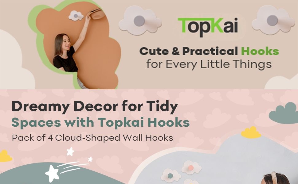
This second excerpt is from a full stack I designed for cloud-shaped wall hooks. The stack is 970 px wide — the standard Basic width — and each module inside it was composed for its own size: wide banners where the module is wide, tight squares where it is square. That per-module composing, not the headline width alone, is what keeps a stack looking designed instead of stretched.
Design Rules I Follow at Every Size
Sizes get you approved. These rules get you conversions:
- One message per module. If a module needs two headlines, split it. The size tables give you up to five Basic modules (seven Premium) — use them.
- Keep text out of image files where a text field exists. Text in the module fields stays crisp at every screen size and can be read by Amazon’s systems. Text baked into a 300 × 300 image is a blur on mobile.
- Respect the small canvases. Quadrant (135 × 135) and four-across (220 × 220) modules are for icons, materials, and single details — never for scenes or sentences.
- Design the comparison chart honestly. Use your own products, consistent 150 × 300 crops, and the same background treatment across the row, or the chart looks rigged and shoppers discount it.
- Stay inside content policy. A+ Content is rejected for things like warranty or guarantee language, unverified superlative claims, reviews and testimonials, pricing or promotion references, and links or mentions of outside websites. Correct sizes will not save policy-breaking copy — build both correctly the first time.
- Preview on mobile before you submit. Modules stack and crop differently on phones. The builder’s mobile preview is the cheapest quality check you will ever run.
My Pre-Flight Checklist
Before any A+ project leaves my desk, I run this list. Steal it:
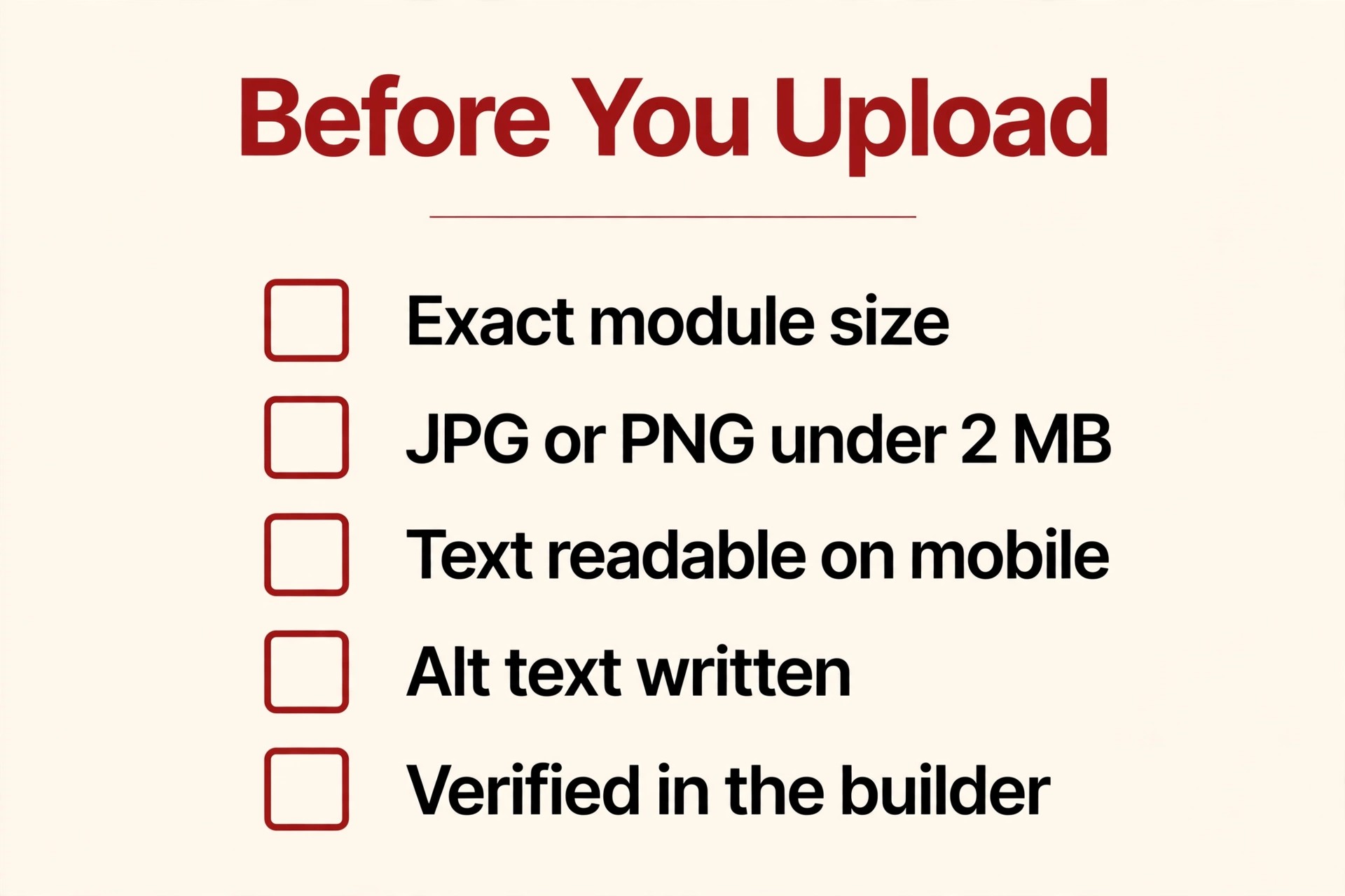
- Every image exported at its module’s exact pixel size — no “close enough” files.
- Format is JPG or PNG; every file under 2 MB.
- Header images keep important content out of the bottom text-overlay zone.
- Small modules (135 × 135, 220 × 220) contain one visual idea and no paragraph text.
- Alt text written for every image — descriptive, natural, no stuffing.
- Comparison chart images are consistent 150 × 300 crops of my own products only.
- No policy risks in the copy: no guarantees, no testimonials, no outside links, no pricing claims.
- Premium eligibility and any disputed dimension (Four Images height, sidebar image) verified in Seller Central for this account.
- Desktop and mobile previews both checked in the builder.
- Source files archived at full resolution, so a future module change never forces a reshoot.
Frequently Asked Questions
What is the standard Amazon A+ Content image size?
There is no single standard size — that is the trap. The most common sizes are 970 × 600 for the header, 970 × 300 for overlay banners, and 300 × 300 for the many square modules. Always design per module.
What size is Premium A+ Content?
Premium’s signature full-width image is 1,464 × 600 px, and Premium allows up to seven modules from 19 module types. Individual Premium modules show their exact size in the builder at upload.
What format and file size does Amazon require for A+ images?
JPG or PNG, with a maximum of 2 MB per image. Export at the exact module dimensions and compress sensibly rather than shrinking below spec.
Do A+ image sizes differ from listing image sizes?
Yes, completely. Listing images need 1,000 px on the longest side to enable zoom (2,000 px recommended), a pure white RGB 255, 255, 255 main image with the product filling at least 85% of the frame. A+ images follow the per-module table in this guide instead.
Why does Amazon reject or blur my A+ images?
Blurring usually means the file was smaller than the module size and got scaled up. Rejections are usually content-policy issues (guarantees, testimonials, outside links, unverified claims) or file problems (wrong format, over 2 MB). Fix size at export, and check copy against policy before submitting.
How do I confirm a size when guides disagree?
Open the module in the A+ Content Manager in Seller Central. The upload prompt for that module shows the dimension Amazon will enforce for your account. When sources conflict — as they do for the sidebar image and the Four Images module — the builder is the tiebreaker.
The Takeaway
A+ Content is not one canvas; it is a kit of canvases. Design each module at its own size — 970 × 600 for your hero, 970 × 300 for banners, 300 × 300 for the squares, 1,464 × 600 if you have Premium — keep files JPG or PNG under 2 MB, write real alt text, and verify the handful of disputed figures in the builder before you export. Do that, and your A+ goes live sharp, on the first submission, without the rework loop.
If you would rather hand the whole kit over, that is literally my day job. I design A+ Content at the correct specs from the first export — tell me about your product and I will tell you honestly whether Basic will do the job or Premium is worth chasing for your catalogue. You can also see the full service on my services page.
6 Responses