
There are two ways A+ Content dies
Most guides about A+ Content mistakes mix two completely different problems into one list. I’ve learned — building A+ Content for Amazon brands full-time — that it helps to split them:
- Approval killers — mistakes that get your A+ rejected or flagged, so it never goes live at all.
- Conversion killers — mistakes Amazon approves happily, but which make shoppers stop reading and leave.
I break down all nine rejection triggers in a separate piece on why A+ Content gets rejected.
This article covers both. And there’s a brand-new addition to the approval-killer list for 2026 that most older A+
guides never mention: if your A+ imagery uses photorealistic AI-generated people, Amazon now requires you to tag them before upload. Amazon announced this requirement in 2026 — tag images containing
photorealistic AI-generated people with the IPTC keyword contains-synthetic-performer in the XMP dc:subject field, and Amazon displays an indicator to shoppers where applicable. The tag isn’t needed for real people edited with AI, fictional or illustrated characters, or images with no people. Since generated models are now common in A+ lifestyle imagery, “untagged AI people” is a compliance mistake your designer might not even know exists — check the current wording in Seller Central news before you submit.
With that out of the way, here are the mistakes I see most.
Part 1: Approval killers — mistakes that keep your A+ from ever going live
1. Promotional language in the modules
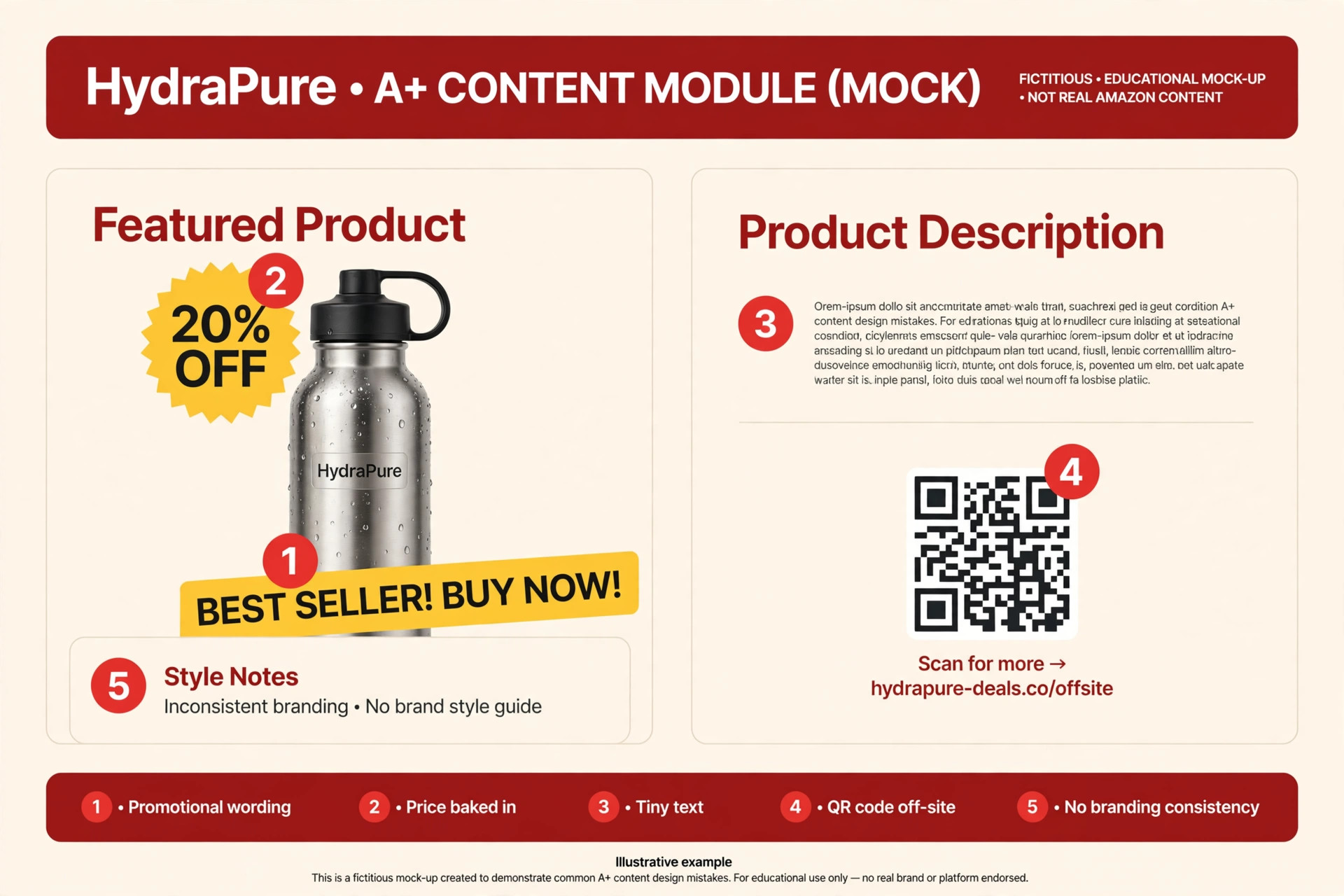
Amazon rejects anything that sounds like an ad. Words and phrases like “best seller,” “top rated,” “cheapest,” “free,” “bonus,” “buy now,” and “add to cart” don’t belong in A+ Content — nor does sale, limited-time, or urgency wording. A+ is product education, not a sales page.
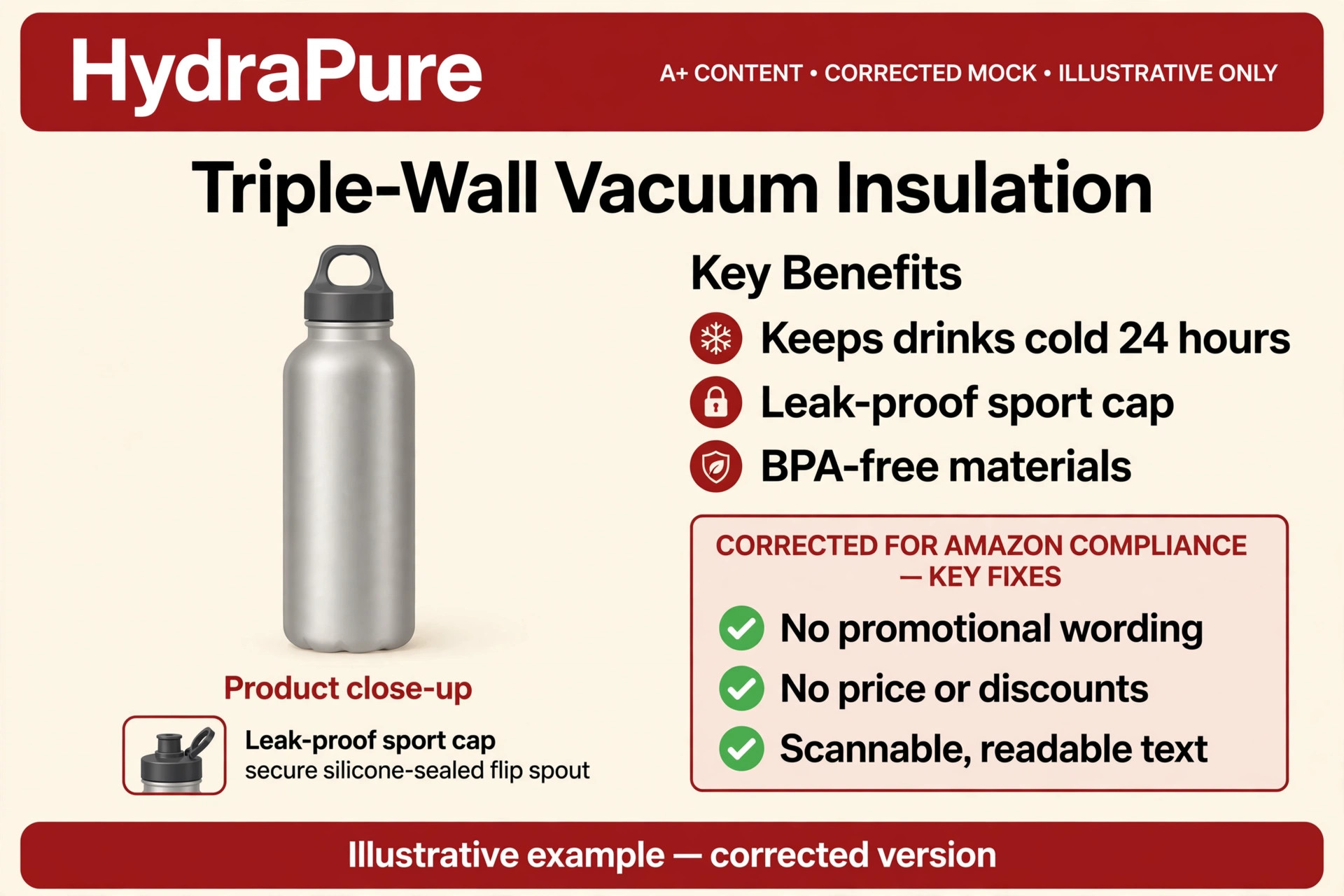
The fix: strip every promotional claim from your copy and imagery before submission. If your headline could sit on a banner ad, rewrite it. “Triple-wall vacuum insulation keeps drinks cold for 24 hours” educates; “BEST INSULATED BOTTLE — BUY NOW” gets rejected.
2. Prices, discounts, or shipping claims — anywhere
No “10% off,” no “free shipping,” not even baked into an image. This is one of the most common rejection triggers I see, because designers who come from web or social creative treat discount badges as normal design elements. On Amazon, pricing lives in the listing’s buy box, not in your content.
The fix: design your modules with zero price references. If a promotion exists, Amazon displays it automatically in the offer area — your A+ never needs to mention it.
3. Guarantee and warranty language
“Money-back guarantee” and “100% satisfaction guarantee” are recurring rejection triggers. This one surprises sellers because guarantees are legal and common on their own websites. Amazon’s content policy simply doesn’t allow them in A+.
The fix: describe what you do instead of what you promise. “Designed for daily use with a reinforced cap” stays; “guaranteed to last or your money back” goes.
4. Unsubstantiated claims — especially eco and health claims
Superlatives need proof; eco and health claims need certification. Words like “eco-friendly,” “biodegradable,” and “green” get flagged without backing, and supplement or wellness products face even stricter scrutiny on health and disease claims. The guides are consistent on this: if you can’t substantiate it, Amazon won’t publish it.
The fix: keep claims concrete and verifiable — materials, dimensions, construction, what’s included. If you hold a real certification, make sure it’s current and documented; if you don’t, rewrite the claim as a plain feature description.
5. Naming or disparaging competitors
Compare against “standard” or “generic” alternatives only. Naming a competitor brand in your A+ — or mocking one — will get the content rejected. Amazon is not the venue for that fight.
The fix: frame every comparison against unnamed alternatives (“vs. standard single-wall bottles”) or against your own other products. Your comparison chart should convert shoppers, not start feuds.
6. Review content and star ratings in the modules
No screenshots of customer reviews, no star ratings lifted from the review section. It doesn’t matter that the reviews are real and on your own listing — Amazon treats review content inside A+ as a policy violation.
The fix: let the review section do its own job. Your A+ should make the product deserve five stars, not display them.
7. Anything that pulls traffic off Amazon
No external URLs, no contact details, no QR codes, no “follow us” social calls to action. Amazon’s interest is obvious: shoppers in your A+ should stay on Amazon. A QR code to your website is a fast track to rejection.
The fix: remove every off-platform element from the design files. Your brand story belongs inside Amazon’s ecosystem — build it there.
8. Amazon’s own branding and sloppy copy
Two quick ones that belong together because they’re both about carelessness: don’t use Amazon logos, smile-style icons, or badges that imitate Amazon branding — and proofread everything. Typos and grammar errors show up in guide after guide as a rejection and quality issue, and they’re the cheapest mistake on this entire list to prevent. Read your A+ out loud before you submit it.
To make this concrete, here’s a mock A+ module I built showing several of these mistakes deliberately marked — promotional wording, price baked in, tiny unreadable text, an off-site QR code, and inconsistent branding, all on a fictional brand so nobody’s real listing is implicated:
And here’s the same module corrected — neutral educational copy, no prices, no promotional language, scannable readable text, consistent branding:
Part 2: Conversion killers — Amazon approved it, shoppers still leave
Getting approved is only half the battle. These are the mistakes that pass Amazon’s review and then quietly cost you sales.
9. Text walls baked into images
Shoppers skim A+ on mobile — dense paragraphs get skipped, not read. When your copy is baked into an image, it can’t be resized, translated, or scanned. One long block of text is a wall shoppers walk around.
The fix: short lines, one message per module, and let the visuals carry the explanation. If you need more words than fit comfortably, that’s a sign you need another module, not smaller text. (I’m covering module structure for skimmers in a separate article soon — this is the single biggest lever in A+ design.)
10. Desktop-only design
Banner text that’s unreadable at mobile width kills the modules most shoppers actually see. Most A+ traffic is mobile, yet I regularly see layouts designed at desktop width, exported once, and never checked in the mobile preview. Some designers even shrink a desktop banner down instead of building the mobile version where a module supports one.
The fix: preview the mobile view in A+ Content Manager before every submission, and build dedicated mobile versions for modules that support them. I keep a full A+ Content image sizes and requirements guide precisely because the desktop/mobile split is where most specs go wrong.
11. Technical quality slips
Low-resolution or upscaled images, wrong module dimensions, CMYK exports shifting color on upload, files over the 2 MB limit or in the wrong format. None of these will always trigger a rejection — but they’ll all make your brand look amateur next to competitors who got the basics right.
The fix: export in RGB (never CMYK), match the module’s exact dimensions, keep files under Amazon’s size limits, and never upscale a small image to fill a big module. Check the sizes guide linked above instead of guessing — wrong dimensions are the most common technical error I see.
12. Repeating the listing instead of answering objections
A+ that restates your bullet points and gallery images adds nothing. This is the strategic mistake, and it’s the most expensive one on this list. The modules that earn their place answer the hesitations a shopper has after reading the listing: sizing and fit, how it actually works, what’s in the box, care and maintenance, and how it compares to the standard alternative.
The fix: before you design a single module, list the top five reasons someone wouldn’t buy — then build one module per objection. If you need a feel for how this looks in practice, my breakdown of A+ Content examples that actually sell shows seven design patterns built around this exact principle.
13. No comparison chart — and no cross-sell
Skipping the comparison module wastes A+’s built-in cross-sell. Think about it: a shopper who decides this ASIN isn’t right for them is about to leave. A comparison chart against your own other products gives them somewhere to go inside your catalog. Without it, they go to a competitor’s listing.
The fix: always include a comparison chart featuring your own products when you have more than one relevant ASIN. A rejected shopper who lands on your other product is still your customer.
14. Inconsistent branding across ASINs and variations
Different colors, fonts, and layouts per child ASIN make your brand look stitched together. Shoppers notice when the variation they clicked has a completely different visual identity than the one they were just looking at. And don’t forget the operational half: remember to actually apply your approved content to all child variations, not just the parent.
The fix: build one brand style for A+ — colors, typography, module rhythm — and reuse it across every ASIN. Consistency is what makes a catalog feel like a brand instead of a collection of listings.
15. Over-design
Too many colors, fonts, and effects competing with the product. The working ceiling in the guides is roughly 3–4 key messages per section (that’s practice, not an Amazon rule). Every decorative element you add is attention you’re taking away from the product.
The fix: pick one accent color, one or two typefaces, and let the product photography do the heavy lifting. Restraint reads as premium; clutter reads as cheap.
My pre-submit checklist (steal this)
Before I submit any A+ project, I run through this list. It’s saved me more rejections than any other habit:
- Copy check: no promotional words, no prices, no guarantees, no competitor names, no review content, no off-Amazon links. Read it out loud.
- Claim check: every superlative, eco claim, and health claim is either removed or substantiated. Supplement and wellness copy gets extra scrutiny.
- AI-people check: any photorealistic AI-generated people tagged with
contains-synthetic-performerin the XMP data before upload (Amazon’s 2026 requirement). - Mobile check: previewed the mobile view in A+ Content Manager; separate mobile versions built where the module supports them.
- Spec check: RGB exports, exact module dimensions, files within size limits. (See my image sizes guide.)
- Strategy check: every module answers an objection or cross-sells — nothing repeats the listing, and a comparison chart keeps shoppers in my catalog.
FAQ
Why does Amazon keep rejecting my A+ Content?
The most common causes are promotional language (“best seller,” “buy now”), prices or discounts in the content, guarantee claims, unsubstantiated eco or health claims, competitor naming, review screenshots, off-Amazon links or QR codes, and typos. Work through the pre-submit checklist above before resubmitting.
Can I use the word “free” in A+ Content?
No — “free” is on Amazon’s promotional-language list for A+. Even “free shipping” will get flagged. Pricing and shipping information lives in the listing’s offer area, not in your modules.
Do I need to tag AI-generated images in A+ Content?
If they contain photorealistic AI-generated people, yes — Amazon announced in 2026 that these must be tagged with the IPTC keyword contains-synthetic-performer in the XMP dc:subject field before upload. Real people edited with AI, fictional/illustrated characters, and images with no people don’t need the tag. Check Seller Central news for the current wording.
How long does A+ approval take?
Amazon doesn’t publish a guaranteed timeline, and I’d rather not quote an unverified number — expect it to take some days and plan your launch calendar accordingly. The fastest way to avoid delays is submitting clean content the first time, using the checklist above.
Will fixing these mistakes actually improve my conversion rate?
Getting rejected content live is the obvious win — dead A+ converts nobody. For approved-but-weak content, the conversion-killer fixes (answering objections, mobile-first design, cross-sell comparison charts) are the changes that move the needle, because they address why shoppers leave instead of why Amazon rejects.
Should I hire a designer or build A+ myself?
If you can follow the spec table and the checklist honestly, Basic A+ is very buildable in-house. Where a designer earns their fee is in the strategy layer — objection-first module planning, mobile/desktop asset sets, and brand consistency across a catalog. That’s the part most DIY pages get wrong.
The bottom line: half of A+ mistakes keep your content off the page entirely, and the other half keep shoppers from caring once it’s there. Run the checklist, design for the skeptic, and remember the 2026 AI-tagging rule — it’s the one your competitors’ older guides never mention. If you’d rather hand the whole thing to someone who lives in A+ Content Manager, here’s how I work.
2 Responses