
I’ve designed a lot of A+ Content stacks over the years, and I can tell you the honest truth: the stacks that convert are rarely the prettiest ones. They’re the most skimmable ones.
Here’s the reality every seller needs to accept: nobody reads your A+ Content. Not really. Shoppers treat it the way people treat every web page — headlines and images first, body copy only where something earns a second look. Eye-tracking research on web reading (the F-pattern finding from the Nielsen Norman Group, back in 2006) established this as a general principle of how people scan pages. I design for that behavior, not against it.
So when I plan a stack, I don’t think of it as a pile of modules. I think of it as a sequence — one message per module, arranged so a skimmer who reads almost nothing still leaves understanding what the product is, why it wins, and which version to buy.
This article walks you through the exact sequence I use, a simple test to check your own stack, the copy rules that make modules skimmable, and a real full-stack example from my portfolio so you can see the structure in action. If you need the image dimensions for each module, I’ve covered those separately in my A+ Content image sizes and requirements guide. And if you’re deciding between tiers, my Premium vs Basic A+ breakdown covers the trade-offs.
The Headline Scan Test: My Favorite 30-Second Audit
Before I explain the sequence, I want to give you the test that diagnoses almost every broken stack. I call it the headline scan test, and it takes less time than making coffee:
1. Open your A+ Content.
2. Read only the module headlines, top to bottom. Skip every image, every paragraph, every bullet.
3. Ask: do those headlines alone tell the product story? What it is, why it wins, proof it works, the key specs, which version to buy?
If the answer is yes, your structure is doing its job — a skimmer is getting your pitch even at a glance. If the answer is no, no amount of beautiful imagery is going to fix it, because you’ve buried your message in copy that skimmers will never read.
Compare these two headline chains:
Failing chain: “Our Story” → “Quality You Can Trust” → “Amazing Features” → “Our Commitment” → “Shop the Collection”
Passing chain: “Quiet Cooling for Hot Sleepers” → “3 Adjustable Fan Speeds” → “What’s in the Box” → “See Which Model Fits Your Room” → “Designed in California, Shipped in 48 Hours”
The first chain is slogans. The second is a story a skimmer can follow. Every headline in the passing chain predicts the module’s content — you know what each section is about before you read a single word of body copy. That’s the whole game.
The 5-Step Sequence I Recommend
Across the A+ best-practice guides I’ve studied, the consensus structure converges on the same arc: orientation → proof → comparison. I’ve refined it into five steps that I use as my default for client stacks. Treat this as a recommended practice from my experience — not an Amazon rule.
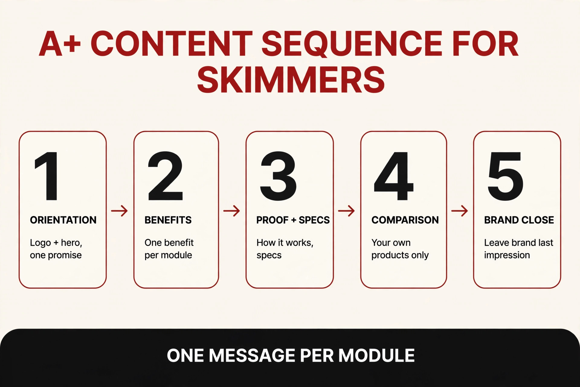
1. Orientation First: Logo + Hero, One Promise
The first module is the only module every shopper is practically guaranteed to see. It cannot be a warm-up. Open with your brand logo and a hero header image that answers two questions in the first screen: what is this, and what’s the single main promise?
The hero headline should be your strongest benefit, front-loaded — the benefit word first, not the brand name and not a vague slogan. “Create Christmas Magic with Every Stamp!” tells a skimmer more in six words than a paragraph of brand mission statement ever will.
2. Core Benefits Next: One Benefit Per Module
Right after orientation, stack your core benefits — single image & text or three-images modules, one benefit each, strongest benefit first. This is where the “one message per module” rule matters most. A module trying to say two things says neither to a skimmer; each benefit gets its own visual home.
One practical note from experience: on mobile, multi-image modules stack vertically, so a three-image module that reads left-to-right on desktop must still make sense top-to-bottom on a phone. Lay out your benefit modules in a vertical narrative, and desktop will take care of itself.
3. Proof and Specs in the Middle
This section is for the shoppers who kept scrolling — they’re interested, and now they have objections. Answer them here: how it works, what’s in the box, materials, dimensions, compatibility, care. This is the place for a scale shot, a how-to strip, a contents checklist.
Critically: don’t repeat the bullet points from above the fold. Your A+ proof section should tell the shopper something new — the close-up that answers “is it durable?”, the diagram that answers “how do I set it up?”, the specs table that answers “will it fit?”. Repetition is the fastest way to get a skimmer to bounce.
4. Comparison Near the End: Your Products Only
A comparison chart belongs near the bottom of the stack, and there’s one hard rule: compare against your brand’s own other products and variations only — never a named competitor. Amazon’s policies are strict about competitor comparisons, and beyond compliance, the business logic is simple: a shopper who decides this ASIN isn’t right for them should land on another ASIN in your catalog, not leave your page.
Done well, the comparison module is a safety net. It catches the “almost” buyer and routes them somewhere they still convert.
5. Close with Brand: Leave the Brand, Not a Spec
End with a brand-story framing or a final lifestyle module that leaves the brand as the last impression — not a spec table. The last thing a skimmer’s eyes touch before they scroll back up to the buy box should feel like your brand, not a spreadsheet.
How Many Modules Can You Use?
The sequence above fits comfortably in the limits Amazon gives you. As of my last check (always confirm current availability in Seller Central’s A+ Content Manager at build time):
| Tier | Max modules | Module types available |
|---|---|---|
| Basic A+ | 5 modules | up to 14 types |
| Premium A+ | 7 modules | up to 19 types |
With Basic’s five-module ceiling, I typically merge proof and specs into fewer modules and let the comparison or brand close absorb the difference. Premium’s seven modules let the full five-step arc breathe. Which tier makes sense for you depends on your catalog — I break that decision down in my Premium vs Basic A+ guide.
Rules for Writing Copy Skimmers Actually Read
Structure gets the skimmer’s eyes moving in the right order. These copy rules make sure each module does its job once the eyes land:
- Think brochure, not blog post. A+ is a visual medium first. A common working rule of thumb from the design guides is roughly 70% visual to 30% text — and I want to be clear that’s a practice, never an Amazon requirement. But it keeps your instinct honest: if a module looks like a wall of text, it will be skipped like one.
- Cap paragraphs at 3–4 lines. If a feature needs more room than that, it deserves its own module or a bullet/highlight format — not a longer paragraph.
- Front-load every headline. The benefit word goes first. “Washable Ink Pads for Mess-Free Crafting” beats “Our Ink Pads” and it beats “Quality Crafting Supplies” by a mile. Headlines must predict the module’s content — that’s what makes the headline scan test pass.
- Keep text out of images. Wherever the module provides a real text field, use it. Text baked into an image shrinks to unreadable on mobile, and — just as important — it can’t be scanned as copy the way real text can. (My A+ mistakes article covers the desktop-only design trap this often pairs with, so I won’t re-teach it here.)
- Write for the vertical stack. Most of your shoppers are on phones. Read your copy top to bottom, module by module, the way it renders on mobile — and check that nothing important lives only on the desktop side of a two-column module.
Anatomy of a Real Stack: Walking a Full A+ Project
Theory is useful; a real stack is better. Below is a full A+ Content stack I designed for Dcraft, a Christmas-themed wooden stamp craft kit — a fun one to study in mid-October, with Q4 right around the corner. Watch how each module does one job:
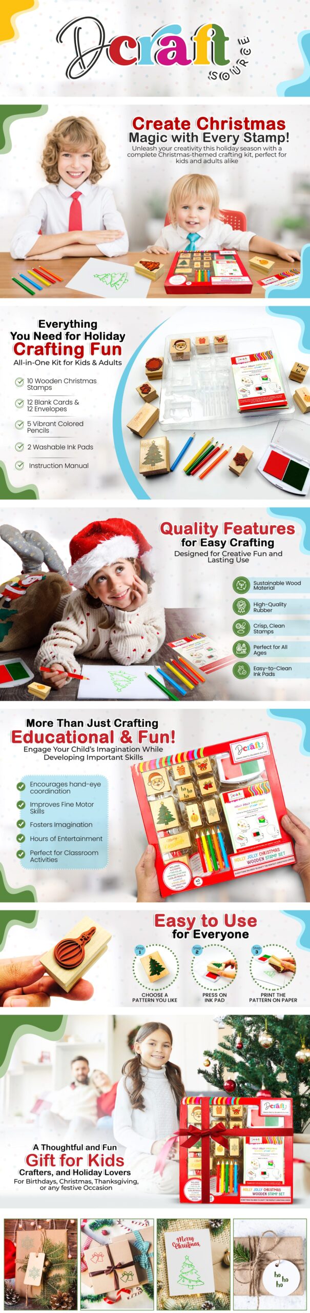
1. Logo header — the Dcraft brand mark, clean orientation. Job: who made this.
2. Hero promise — “Create Christmas Magic with Every Stamp!” over a lifestyle photo of kids crafting. Job: what it is, and the one big promise.
3. What’s in the box — “Everything You Need for Holiday Crafting Fun,” with a checklist of the 10 stamps, cards, pencils, ink pads, and manual. Job: proof of value — you’re getting a complete kit.
4. Quality features — “Quality Features for Easy Crafting,” icon-driven: sustainable wood, high-quality rubber, crisp clean stamps, easy-to-clean ink pads. Job: core benefit one, quality.
5. Educational angle — “More Than Just Crafting: Educational & Fun!” with hand-eye coordination, fine motor skills, imagination. Job: core benefit two — the deeper reason to buy, aimed at parents.
6. How it works — “Easy to Use for Everyone,” a 3-step strip: choose a pattern, press on the ink pad, print on paper. Job: proof — removes the “is this complicated?” objection.
7. Gifting angle — “A Thoughtful and Fun Gift for Kids, Crafters, and Holiday Lovers.” Job: use case — answers “who is this for?” and catches the Q4 gift buyer.
8. Lifestyle gallery — four panels of finished crafts: stamped cards, wrapped gifts, tags. Job: emotional close — the brand and the outcome as the last impression.
Now run the headline scan test on that stack: “Create Christmas Magic with Every Stamp” → “Everything You Need for Holiday Crafting Fun” → “Quality Features for Easy Crafting” → “Educational & Fun” → “Easy to Use for Everyone” → “A Thoughtful and Fun Gift.” Six headlines, and you already know what the product is, why it’s good, how it works, and who it’s for. That’s a passing stack.
You’ll notice this real project doesn’t follow my five steps with textbook rigidity — some benefits land before the proof section, and there’s no formal comparison chart (a single-product craft kit doesn’t need one). That’s normal. The sequence is a default, not a cage; the principle — one message per module, headlines that tell the story — is what doesn’t bend.
Structure Mistakes I Keep Seeing
If you want a longer list of what goes wrong, my A+ mistakes article goes deep. But these are the structure-specific sins that fail the headline scan test every time:
- The warm-up opener. Leading with “Our Story” or a brand mission statement. Your brand story is your closing module, not your opening one — the first screen belongs to the product promise.
- Benefits before orientation. Jumping into feature modules before the shopper knows what the product is. Sequence matters: orientation, then benefits.
- Comparison charts featuring competitors. Against policy, and it hands your shopper a reason to leave. Your own variations only.
- Every module says everything. The spec table repeats the hero copy, the features module repeats the bullet points. Each module gets one new job — skimmers punish repetition with the back button.
- Baked-in text walls. Beautiful desktop modules where all the copy is flattened into the image. Unreadable on mobile, unscannable everywhere.
The Pre-Launch Structure Audit
Before you submit any stack, I run through this checklist. Steal it:
- ☐ The first module shows the logo and the one main promise — no warm-up.
- ☐ Reading only the headlines tells the full product story (the headline scan test).
- ☐ Each module has exactly one message; nothing repeats another module’s job.
- ☐ The strongest benefit appears before weaker ones.
- ☐ Proof and specs answer a real shopper objection (size, setup, care, contents) — not a bullet-point repeat.
- ☐ Any comparison chart features only my own products/variations.
- ☐ The last module leaves a brand or lifestyle impression, not a spec table.
- ☐ All copy lives in text fields, not baked into images.
- ☐ The mobile vertical stack reads sensibly top to bottom.
- ☐ Module count fits the tier I’m building in (5 for Basic, 7 for Premium).
FAQ
How many modules should my A+ Content have?
As many as the story needs, up to your tier’s ceiling — five for Basic, seven for Premium. More modules isn’t automatically better; a tight four-module stack that passes the headline scan test will outperform a bloated seven-module stack where every module says the same thing twice. Start with the five-step sequence and trim until every module has a job.
Should benefits or specs come first?
Benefits first, specs in the middle. Skimmers decide whether they care in the first screen or two — that’s your benefit territory. Specs and proof belong further down, where the interested shopper is looking for reasons to say yes to specific objections. Leading with a spec table is asking a skimmer to care about details for a product they haven’t decided they want.
Can I compare my product to competitors in A+ Content?
No — compare against your own products and variations only. Amazon’s policies don’t allow naming or depicting competitor products in A+ Content, and strategically you’d be advertising someone else’s listing on your own page. The comparison module’s job is to keep the “almost” buyer inside your catalog.
Do shoppers read A+ differently on mobile?
The sequence doesn’t change, but the layout does. Multi-image modules stack vertically on phones, so anything that reads left-to-right on desktop has to read top-to-bottom on mobile too. I always check the vertical flow on a phone-width preview before submitting — if a module only makes sense as a side-by-side, it needs restructuring.
What’s the ideal text-to-image ratio in A+ Content?
There’s no Amazon requirement for this. The working rule of thumb I design to is roughly 70% visual, 30% text — a brochure, not a blog post. In practice, I just enforce the real rules underneath it: short paragraphs, front-loaded headlines, one message per module, and no baked-in text. Hit those and the ratio takes care of itself.
Want a stack built for skimmers? I design A+ Content for Amazon sellers every day — sequence, copy, and modules that pass the headline scan test before they ever reach Seller Central. See how I work on my A+ Content design service page, browse more real examples in my A+ Content examples roundup, or reach out here and tell me about your product.