I design A+ Content for Amazon supplement brands every month, and I’ll tell you something most designers won’t admit: the compliance rules don’t limit good supplement design — they define it. The brands that sell well in this category don’t win with louder promises. They win with clearer structure: transparent ingredients, obvious how-to-use instructions, and trust signals that don’t need a medical promise attached.
That’s my angle on this article. What works in supplement A+ is not about shouting benefits Amazon will flag. It’s about designing the compliance limits into the layout from the very first wireframe, instead of building a beautiful stack of claims and watching it come back rejected.
Why supplement A+ is a different design problem
Every other category lets the copy drive the design. In supplements, the copy rules drive the design for you. Amazon treats dietary supplements as a special-compliance category, and that changes everything about how I lay out a stack.
Three forces shape the work: first, FDA claim rules (disease claims are prohibited for dietary supplements; structure/function claims are the permitted lane). Second, Amazon’s own supplement policy — full-label image expectations, third-party cGMP verification through its TIC programme, and label-vs-listing consistency. Third, AI enforcement: reporting in March 2026 (from ppc.land and NutraIngredients, ahead of a reported March 31 enforcement rollout) described Amazon tightening automated scanning of titles, descriptions, and even image text for Supplement Facts panel discrepancies.
The designer’s takeaway: this applies to module text and text baked into images — Amazon scans image text too. So the compliance work isn’t a legal review at the end. It’s baked into the layout.
One line that matters for the whole article: this is a design article, not legal advice. Confirm your claims against your approved label and Seller Central’s current supplement policy before submitting A+.
The claim rules that shape your layout
Think of these as the frame, not the painting. Everything below is the safe-to-print guidance as Amazon and FDA rules stand; the painting is your design inside it.
Disease claims are off the table
A dietary supplement listing or A+ module cannot say the product diagnoses, treats, cures, mitigates, or prevents a disease, or that it works like or replaces a prescription drug — unless the claim carries FDA drug approval. Full stop.
For the layout, this means I never design a headline slot that begs for a disease claim. If your template has a big bold headline that reads like a promise (“Finally ends your joint pain!”), the design is inviting a violation. I write headlines that describe structure, ingredients, and routine instead.
Structure/function claims are the permitted lane — and the disclaimer needs a home
The allowed wording pattern is “supports [normal function]” or “helps maintain…” — describing normal body structure or function rather than promising a disease outcome.
Where structure/function claims appear, the standard DSHEA disclaimer belongs with them:
These statements have not been evaluated by the Food and Drug Administration. This product is not intended to diagnose, treat, cure, or prevent any disease.
The design implication is practical: leave a planned, legible home for that disclaimer in the layout. I’ve seen brands shrink it into unreadable footer text on mobile — don’t. A disclaimer module at the end of the stack, sized to stay readable on a phone, is part of a compliant design. If the disclaimer isn’t legible, the compliance work is undone.
Everything must match the Supplement Facts panel — exactly
Ingredient names, amounts, serving-size language: every one must align with the panel. No inflated ingredient weights, no raw-material-equivalent storytelling, no featuring an ingredient as a selling point if it isn’t on the panel. The March 2026 reporting described Amazon’s AI enforcement targeting exactly this label-vs-listing alignment — panel discrepancies can trigger flags, and in the reported cases, delistings.
For the designer, this means the Supplement Facts panel is a source of truth, not a suggestion. I keep the panel image or file open the entire time I’m building the stack, and every ingredient module gets checked against it before I sign off.
What actually works, design-wise
Now the positive half. Inside the compliance cage, these are the patterns I return to for every supplement stack — and they’ve passed review.
1. Make the ingredient panel the hero
One ingredient per visual unit, exact label amount beside it. This is the single strongest module in supplement A+ because it turns the product’s strongest asset — transparency — into the visual centerpiece.
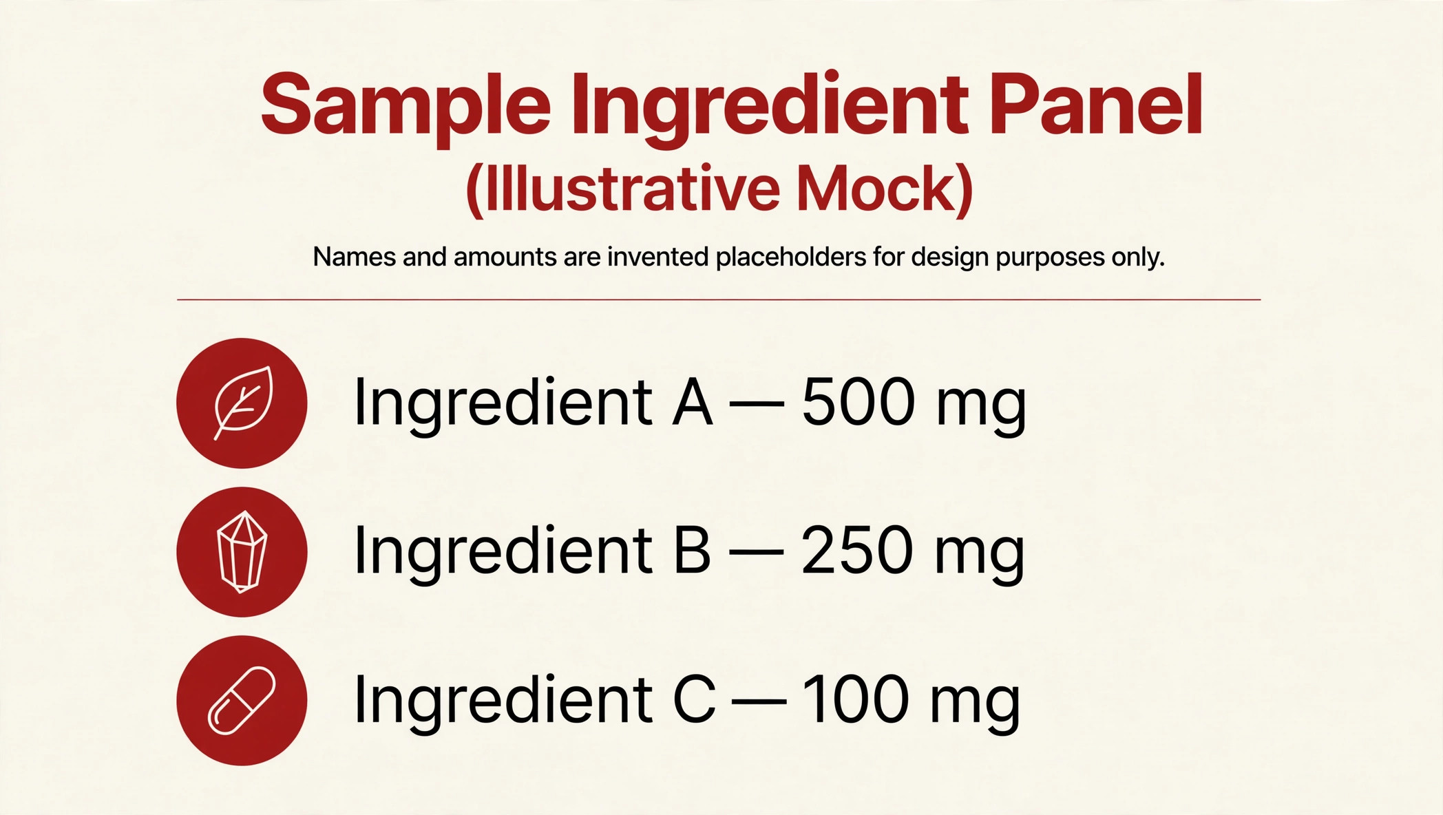
The rule I follow: photography or iconography that explains what the ingredient is, never what it promises. A leaf icon next to a botanical’s name tells the shopper what they’re looking at. A before/after silhouette next to the same ingredient tells a promise that gets flagged.
2. Build a crystal-clear how-to-use sequence
Numbered serving routine: when, how much, with what. This is the most underrated module in supplement A+, because usage confusion is a real source of bad reviews — and bad reviews are a conversion problem no claim can fix.
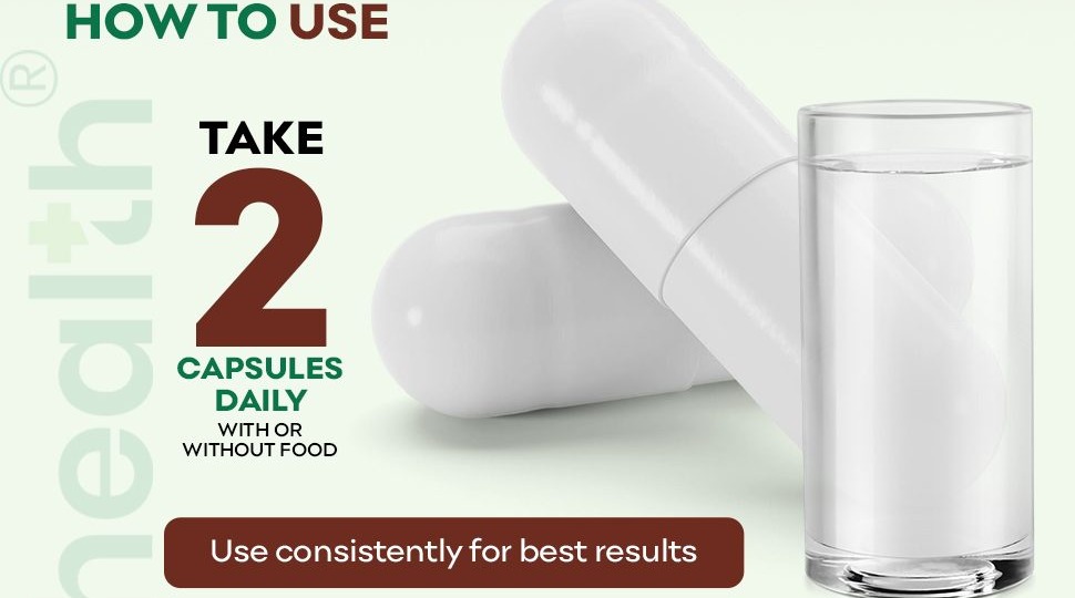
A recent stack I designed for a supplement brand is a good worked example — not for its copy, but for its structure. The how-to-use section runs as a vertical numbered sequence: each step is its own visual unit with generous whitespace, a numbered step marker, a small supporting icon, and one line of instruction text. The hierarchy is ruthless — step number first, action second, detail last — and the sequence ends at the bottom of the stack so the shopper finishes on routine, not on promises. The layout does the explaining so the copy doesn’t have to work hard, which is exactly what you want in a regulated category: when the design is clear, the copy can stay quiet.
3. Use routine framing, never outcome framing
Show where the product fits a morning or evening routine — never show a promised body or medical result. Lifestyle photography of the bottle on a kitchen counter next to a glass of water, the product in a gym bag, a nightstand scene: these all sell the habit, not the outcome.
The test I run on every image: could a reasonable shopper read this photo as promising a medical result? If yes, it doesn’t ship. Lifestyle shots pass; transformation imagery never does.
4. Keep the comparison chart brutally disciplined
Compare on verifiable facts only: serving size, ingredient amounts per the panel, form factor, count. Never on efficacy.
A compliant comparison chart looks boring to a marketer and beautiful to a compliance reviewer. Rows: capsules per serving, servings per bottle, key ingredient per panel, form factor, price per serving (if you want to). Columns: your product, a generic competitor. Nothing about whose formula “works better” — because that’s an efficacy claim wearing a chart costume.
5. Build trust without badges
A clean, readable full-label module is a trust feature, not wasted space. Amazon’s supplement policy expects clear images of the complete product label — including the Supplement Facts panel, ingredients list, and manufacturer/distributor details. So give it a proper module with photography-quality rendering instead of burying it.
On certifications, the rule is simple: reference cGMP or third-party testing only where the brand holds current third-party certification it can document — Amazon requires third-party cGMP verification through its TIC programme. I never invent a badge, and I never design anything resembling “FDA approved” — supplements are not FDA-approved, and implying it is itself a violation.
My go-to module order for a supplement stack
Order is a design decision too. The sequence I use on nearly every supplement stack walks the shopper from trust to detail to routine:
1. Brand banner — one line about the brand’s philosophy, no claims.
2. Ingredient hero — one ingredient per visual unit with exact panel amounts.
3. Routine/lifestyle module — where the product fits the day.
4. How-to-use sequence — numbered serving steps, when and how much.
5. Full-label module — clean, readable label photography including the Supplement Facts panel.
6. Comparison chart — verifiable facts only.
7. DSHEA disclaimer module — legible on mobile, never footer-sized.
This order sells without claiming: it opens on transparency, answers every practical question, and closes on compliance. Nothing here needs a promise to persuade.
Words I design out of every supplement stack
Keep this as a checklist beside your drafts. The left column is the high-risk pattern; the right column is the safer design instinct.
| Design it out | Design this instead |
|---|---|
| Cure / treat / heal / prevent / diagnose | Supports / helps maintain (structure/function framing) |
| Disease names as promised outcomes | The ingredient itself, named with its panel amount |
| “Detox” / “flushes toxins” | Transparent ingredient list and label imagery |
| “Burns fat” / before/after promises | Routine and lifestyle photography |
| Guaranteed or time-bound results | Exact serving instructions and serving count |
| “Clinically proven” / “doctor recommended” (without documented substantiation) | Third-party certification references only where documented |
FAQ
Can I use health claims in supplement A+ Content at all?
Disease claims — wording that a product diagnoses, treats, cures, mitigates, or prevents a disease — are prohibited for dietary supplements on Amazon. Structure/function claims (“supports…”, “helps maintain…”) are the permitted lane, and they need the DSHEA disclaimer placed with them. I design every stack inside that boundary.
What is the DSHEA disclaimer, and where does it go in A+?
It’s the standard statement: “These statements have not been evaluated by the Food and Drug Administration. This product is not intended to diagnose, treat, cure, or prevent any disease.” I place it in its own legible module near the structure/function claims — readable on mobile, never shrunk into footer-sized text.
Do my A+ ingredient amounts have to match the Supplement Facts panel exactly?
Yes. Ingredient names, amounts/weights, and serving-size language in A+ must align with the panel — no inflated weights, no raw-material-equivalent storytelling. Reporting in March 2026 described Amazon tightening AI-powered enforcement of exactly this alignment, so I treat the panel as the single source of truth for every module.
Why did my supplement A+ get rejected?
The most common killers are disease claims in text or images (Amazon scans image text too), ingredient amounts that don’t match the panel, invented badges like “FDA approved,” and missing or unreadable full-label imagery. I wrote a longer breakdown of approval killers in my article on Amazon A+ Content mistakes — the health-claim section there applies directly.
Can I compare my supplement to competitors in A+?
Yes — if the comparison is on verifiable facts only: serving size, ingredient amounts per the panel, form factor, count. The moment a chart implies one formula works better than another, it’s an efficacy claim.
What’s the single highest-value module in supplement A+?
In my experience, the ingredient panel — one ingredient per visual unit, exact label amount beside it, photography that explains what the ingredient is. Transparency sells without claiming. For more A+ patterns that convert across categories, see my Amazon A+ Content examples.
Supplement A+ is where design discipline matters most on Amazon. The brands that win aren’t the ones with the boldest claims — those are the ones that get flagged. The winners are the ones whose stacks a shopper can scan in thirty seconds and understand completely: what’s in it, how to use it, and how to trust it.
That’s what I build. If you sell supplements on Amazon and want an A+ stack designed inside the compliance cage — not despite it — contact me or see my A+ Content design service.
One Response