I design A+ Content for beauty brands every month, and here’s what I’ve learned: beauty is the one category where the visuals do almost all the persuading — and also the one category where the wrong words can get your whole module stack rejected. That tension is exactly what this article is about. What works in beauty A+ isn’t louder selling. It’s premium-looking design built inside honest, claim-safe language from the very first wireframe.
I come at this the same way I came at my supplement A+ guide: the compliance rules don’t limit good design — they define it. Supplements have FDA structure/function lanes; beauty has the cosmetic-vs-drug claim line. Different rulebook, same design philosophy: build the limits into the layout before a single pixel is placed, instead of designing a stack of promises and watching Amazon flag it.
One line that matters for the whole article: this is a design article, not legal advice. Confirm your claims against Seller Central’s current beauty-category policy before submitting A+.
Why beauty A+ is a different design problem
In most categories, the copy leads and the visuals follow. In beauty, the texture close-up, the shade swatch, the ritual sequence — these ARE the pitch. Nobody buys a moisturizer because the module says “moisturizing.” They buy it because the macro shot of the texture looks like something they want on their skin at 11pm tonight.
Three forces shape beauty A+ design: first, the cosmetic-vs-drug claim boundary, which decides which words are allowed to appear at all. Second, Amazon’s scanning of module text and text baked into images — a flagged phrase in an infographic overlay gets flagged just the same. Third, the beauty shopper herself: she reads ingredients, compares shades carefully, and buys routines, not just products. Your A+ has to serve all three masters at once.
The result: beauty A+ that works is premium presentation with disciplined restraint. Rich, editorial-looking photography and clean module architecture — wrapped around language that describes appearance, texture, ritual, and routine, and never promises a medical outcome.
The claim rules that shape the design
The dividing line is cosmetic claims vs drug claims. This is the single most important thing a beauty brand needs to internalize before designing A+. Phrases that suggest a product cures or treats a medical condition — “cures acne,” “treats eczema” — push the product toward drug classification under FDA rules, and Amazon restricts that language in listings and A+ modules alike. The safe lane is appearance language: describing how skin looks, not what the product heals.
The design implication is huge. I never build a headline slot in beauty A+ that begs for a transformation promise. If the template’s big bold headline reads like it wants to say “eraser for wrinkles,” the design is inviting a violation. I write headlines that describe texture, shade, ritual, and routine instead — and those headlines pass review the first time.
Clinical-sounding language draws scrutiny
Words like “clinically proven,” “dermatologist recommended,” and “pharmaceutical grade” imply medical validation a cosmetic product can’t claim. Amazon’s automated scanning flags this language even when it lives only in an image overlay or a module caption — it doesn’t matter that it isn’t in your bullet points. I’ve seen brands burn a full review cycle because a badge graphic said “dermatologist approved” and nobody in the brand had third-party documentation to back it.
My rule: no badges in beauty A+ unless the brand holds current, showable third-party documentation. Self-made seals aren’t trust — they’re flags.
Transformation language is restricted
“See results in X days,” “dramatic improvement,” before-and-after framing — Amazon’s content policy restricts outcome-implying language in listing copy AND image text. This is where beauty A+ diverges from beauty advertising everywhere else: the exact tactic that built the beauty industry (the transformation promise) is the one you can’t use in your modules.
So what replaces it? Showing. A texture module doesn’t need to promise smooth skin — it shows a texture worth touching. A ritual module doesn’t need to promise a transformation in seven days — it shows a routine worth doing twice a day. The module patterns below are the “instead.”
Ingredient transparency is a trust feature, not a risk
Beauty shoppers read ingredients. And here’s the underused move: a clean, legible full-label or ingredient panel module is premium trust design in beauty. The label itself is the proof — product name, net quantity, full ingredient list, maker name. Brands that hide their formula look like they have something to hide; brands that lay it out cleanly look like they have nothing to fear.
The design discipline: present one key ingredient per visual unit, describe what it IS — its origin, its texture, its place in the routine — and never what it will DO to the buyer’s body. “Tallow, whipped into a balm” is design-safe. “Tallow that heals your skin” is not.
The module patterns that actually work in beauty
The shade-finder module
For color cosmetics, this module is the purchase. One swatch per shade, consistent lighting and scale across every swatch, photographed rather than rendered where possible. Shade inconsistency — one swatch shot in warm light, the next in cool — is the top return-driver in color cosmetics, because the buyer chooses a color from this module and receives a different one.
Design rules I follow: identical framing for every swatch, shade names in clean legible type, and the swatches ordered the way a buyer shops (light to deep, or warm to cool — never random). If the brand has more than six shades, I paginate the module visually rather than cramming.
The texture module
In beauty, texture IS proof. A macro close-up of the balm, the serum drop, the pressed powder — this is the module that does what adjectives can’t. Design one module entirely around texture: a large hero texture shot, two or three supporting angles, and minimal copy (“whipped,” “weightless,” “velvet-matte” — sensory, not medical).
Why it works within the rules: a texture shot makes no claim Amazon can flag. It simply shows the product being the product. The richest beauty A+ stacks I’ve built spend their biggest module on the smallest detail.
The ritual module
Beauty shoppers buy routines, not products. This is the beauty version of the how-to-use module I wrote about in my supplements guide: a numbered application sequence — when, how much, in what order, layered with what. Cleanse → treat → moisturize. AM / PM splits. “A pea-sized amount” with a visual reference for what a pea-sized amount actually is.
The conversion logic: a buyer who can picture the product inside her own routine has already halfway bought it. And every step is claim-free — it’s instruction, not promise.
The ingredient-panel module
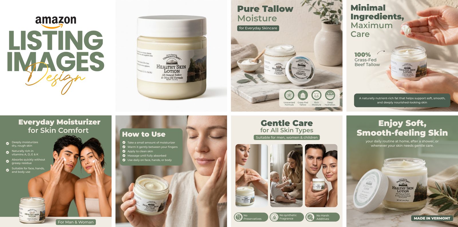
One key ingredient per visual unit, described as what it is. This is the hero module for “clean” and “minimal-ingredient” positioning: the ingredient, its source or story, its role in the formula. The tallow moisturizer listing-image set I designed (image A above) is built exactly this way — “naturally rich in vitamins A, D, E & K” describes the formula’s character, never a medical outcome.
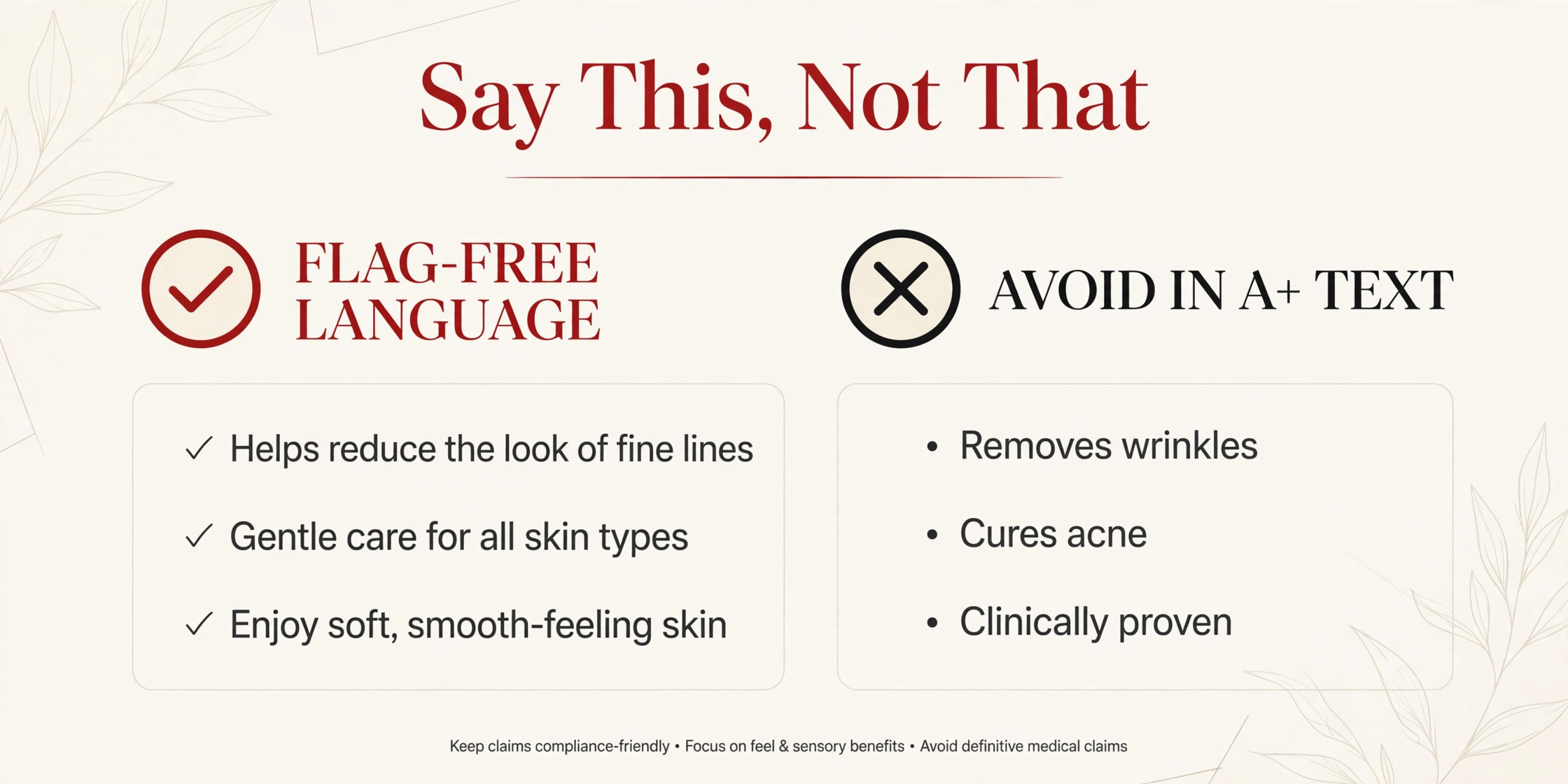
The guardrail: never describe an ingredient by what it will do to the buyer’s body. If the sentence starts with the product and ends with a bodily outcome, rewrite it.
The comparison-chart module, with discipline
Comparison charts sell in beauty — but only on verifiable facts. Shades available, size and weight, finish (matte vs dewy), form factor (balm vs lotion vs serum), scent profile. These are facts a buyer can check.
Never compare on efficacy. “Our cream vs theirs: which erases wrinkles faster?” is exactly the module pattern that draws enforcement. I keep a pinned rule on my wall for beauty comparison charts: facts, never promises.
Trust without badges
Real certifications only, where the brand holds current third-party documentation it can show. Cruelty-free, vegan, GMP, organic — if the certification is real and current, it earns a module slot with the certifying mark used correctly. If it’s a self-made seal, it earns nothing but risk. In beauty, the most trustworthy design element is often the plain full-label module — the one that says “here is everything, read it yourself.”
Mobile is where beauty A+ lives or dies
Most of your beauty A+ will be read on a phone, in bed, at night. That context changes design decisions: text baked into images must stay legible at phone width — shade names, ingredient lists, routine steps. I design beauty modules mobile-first, then check desktop, not the other way around. A gorgeous desktop stack that turns shade names into 6-point type on a phone is a return slip waiting to happen.
A pre-flight checklist for beauty A+
Before any beauty stack goes into A+ Content Manager, I run it through this:
- Claim scan: every headline, caption, and baked-in-text phrase describes appearance, texture, ritual, or routine — no cure/treat language, no “clinically proven,” no time-bound result promises.
- Badge audit: every seal on the page is backed by current third-party documentation the brand can produce.
- Ingredient consistency: every ingredient name and descriptor matches the actual product label.
- Shade module QA: all swatches share lighting, scale, framing, and ordering logic.
- Comparison discipline: the chart compares verifiable facts only — no efficacy claims.
- Mobile legibility: open every module on a phone; if baked-in text needs a pinch-zoom, redesign it.
- Policy check: one final pass against Seller Central’s current beauty-category policy — rules move, and “it was fine last year” is not a defense.
Frequently asked questions
Can I mention skin concerns like acne or wrinkles in beauty A+?
You can name concerns in cosmetic language — “the look of fine lines,” “blemish-prone skin” — and describe your product’s texture, routine, and ingredients. What you can’t do is position the product as diagnosing, treating, curing, or preventing the condition. The line is appearance vs. outcome: describe the look, never promise the fix.
Are before-and-after photos allowed in Amazon beauty A+?
Transformation framing — before/after photos, “results in X days” language — is restricted under Amazon’s content policy for listing copy and image text. I design around it with texture modules, ritual sequences, and ingredient transparency, which sell without a transformation claim.
Do I need Brand Registry for beauty A+?
Yes — A+ Content requires Brand Registry enrollment plus a Professional selling plan, for any category.
Should my beauty A+ show the full ingredient label?
If the formula is a selling point — clean, minimal, premium — then yes, and it’s one of my favorite trust modules. Just make sure every name on the page matches the actual label exactly.
What I’d build for your beauty brand
If you’re a beauty brand selling on Amazon — skincare, haircare, color cosmetics — this is the work I do every week: premium, editorial-feeling A+ stacks built inside the claim boundaries from the first wireframe, so nothing gets flagged and everything converts. Browse my A+ Content design service to see the approach, or get in touch and tell me about your line — I’ll tell you honestly which module patterns fit your products.