
Your main image wins the click. Your infographics win the decision.
Most Amazon sellers get this backward. They spend weeks on the hero image, then fill the remaining image slots with whatever is left over — a zoomed-in photo here, a wall of text there, a stock lifestyle shot that doesn’t even show the product clearly. Then they wonder why traffic doesn’t convert.
Amazon product infographics are where hesitant shoppers get their questions answered. Done well, each infographic resolves one specific doubt: Will it fit? Is it easy to clean? What’s actually in the box? How is this different from the cheaper option? Done poorly, they’re decoration — and decoration doesn’t sell.
This guide walks through how to plan, design, and publish Amazon infographics that do real persuasive work: the image rules you must follow, a step-by-step objection-first planning method, the seven infographic types worth using, mobile-first design rules, the mistakes that kill performance, and a pre-publish checklist.
Why Infographics Carry the Sale on Amazon
Amazon shoppers behave differently from website visitors. On your own store, you control the layout, the narrative flow, and the pacing. On Amazon, every listing in your category looks structurally identical: same title format, same bullet layout, same review placement. Your images are one of the few places where you can actually differentiate.
Three things make infographics disproportionately important:
Shoppers scan images before they read. Watch anyone shop on Amazon and you’ll see the pattern: they open the listing, swipe through the image gallery, glance at the price and rating, and only then — maybe — read the bullets. If your gallery doesn’t answer their questions, many never reach your copy.
Infographics compress decisions. A dimension chart answers “will it fit my space?” in two seconds. A comparison table answers “why not the cheaper one?” instantly. Bullets can say the same things, but images are processed first and remembered longer in a scanning context.
They reduce the two costliest outcomes: lost sales and returns. Most returns happen because the product didn’t match expectations — wrong size, missing accessory, harder to use than expected. Every one of those is a communication failure your image slots could have prevented.
One honest note before we continue: you’ll see articles claiming infographics boost conversion by specific percentages, or that “the brain processes images 60,000 times faster than text.” The latter is a long-debunked marketing myth, and the former is rarely backed by published methodology. This guide won’t invent numbers. What follows is based on Amazon’s published requirements, observable shopper behavior, and design principles that hold up across categories.
What an Amazon Infographic Is (and Where It Lives in Your Listing)
An Amazon product infographic is a secondary listing image that combines product photography with explanatory graphics — text callouts, icons, diagrams, comparison tables, or dimension overlays — to communicate something a plain photo can’t.
It lives in image slots 2 and beyond. Slot 1 is your main image, and Amazon’s rules for it are strict: pure white background (RGB 255, 255, 255), product filling at least 85% of the frame, no text, no logos, no badges, no props. Your infographics go in the additional image slots, where text and graphics are allowed.
Think of each infographic as answering exactly one buyer question. If you can’t state an infographic’s job in a single sentence — “proves it fits standard kitchen cabinets,” “shows what’s in the box,” “explains the 3-step setup” — it doesn’t have a job yet.
Infographics are also distinct from A+ Content. A+ modules sit below the fold in the product description area and require Brand Registry. Infographics sit in the image gallery, visible immediately, and every seller can use them regardless of brand registration. If you’re choosing where to invest first, infographics come first — they reach every shopper, including the ones who never scroll.
For the broader image-stack strategy (main image, lifestyle, video), our guide to listing image strategy covers how all the slots work together.
Amazon’s Image Rules: What to Follow Before You Design Anything
Designing a beautiful infographic that Amazon suppresses is wasted work. These Amazon listing image requirements are the ones that matter, drawn from Amazon’s published image guidelines:
| Requirement | Specification |
|---|---|
| Canvas size | Minimum 1,000 px on the longest side (enables zoom); 2,000 × 2,000 px recommended |
| Color profile | sRGB |
| File format | JPEG preferred (best quality-to-size balance); TIFF and PNG accepted |
| Main image background | Pure white, RGB 255, 255, 255 — no exceptions |
| Main image framing | Product fills at least 85% of the frame |
| Main image prohibitions | No text, logos, watermarks, badges, borders, or extra props |
For infographics specifically — secondary slots — keep these policy points in mind:
- Represent the product accurately. Lifestyle scenes should show the actual product, not a misleadingly premium version of it.
- Avoid fake badges and awards. Adding Amazon-style “#1 Best Seller” badges or invented award seals to your images can get them flagged. Amazon awards its own badges; don’t manufacture yours.
- Be careful with claims, especially in health, beauty, and supplements. Before/after imagery and disease-treatment claims attract scrutiny. If a claim needs a disclaimer on the packaging, it needs one in the creative too — or better, leave it out.
- Text is allowed in secondary images, but legibility is on you. Amazon won’t reject small text, but shoppers on phones simply won’t read it (more on mobile rules below).
When in doubt, check the current “Product image requirements” help page inside Seller Central — Amazon updates enforcement periodically, and the help page is the source of truth.
The Objection-First Method: Plan Your Infographics Before You Design Them
The single biggest difference between infographics that sell and infographics that decorate is the planning step most sellers skip. Don’t start with “what features should we show?” Start with “what is the shopper afraid of?”
Step 1: Collect real buyer objections
Open your listing’s reviews, your competitors’ 1–3 star reviews, and the customer Q&A section. You’re mining for friction — every complaint, question, and return reason is an objection your images should preempt. Sort them by frequency.
Step 2: Rank your top 5–7 objections
You have limited image slots. List the objections that actually kill sales, not the ones that are merely nice to address. “Will it fit?” beats “is the packaging recyclable?” for most products.
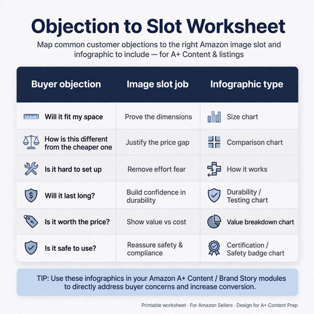
Step 3: Map each objection to one image slot
One objection, one image. This is the discipline that separates converting galleries from cluttered ones.
| Buyer objection | Image slot job | Infographic type |
|---|---|---|
| “Will it fit my space?” | Prove the dimensions | Size/dimension chart |
| “How is this different from the cheaper one?” | Justify the price gap | Comparison chart |
| “Is it hard to set up?” | Remove effort fear | How-it-works (3 steps) |
| “What exactly arrives?” | Set expectations | What’s in the box |
| “Will it work for my use case?” | Show it in context | Lifestyle in context |
| “Can I trust this brand?” | Reduce risk | Trust/guarantee panel |
Step 4: Translate features into benefits, then into proof
Features describe the product. Benefits describe the outcome. Proof makes the benefit believable. An infographic needs all three layers: “Triple-layer insulation” (feature) → “coffee stays hot for 6 hours” (benefit) → a temperature-retention diagram or test visual (proof). Most weak infographics stop at the feature.
Step 5: Write the headline before you design
If the headline isn’t clear as a sentence, the design can’t save it. Write every infographic’s headline as the direct answer to its objection: not “Advanced Insulation Technology” but “Stays Hot 6 Hours. Cold 12.”
Illustrative example (not a real client): an electric milk frother. Review mining surfaces four objections: “does it work with oat milk?”, “is it loud in the morning?”, “how do I clean it?”, “will it fit under my cabinets?” The gallery plan becomes: slot 2 — compatibility chart (dairy/oat/almond/soy with checkmarks); slot 3 — “Quieter than your coffee grinder” with a simple decibel comparison; slot 4 — 3-step rinse-clean visual; slot 5 — dimension overlay showing 8.2″ height against a standard 18″ cabinet clearance. Every slot earns its place.
The Anatomy of an Infographic That Converts
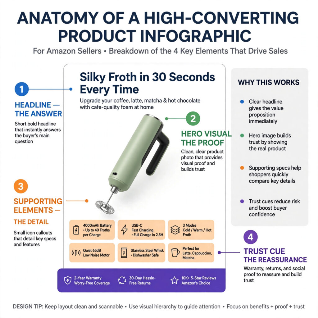
Every effective infographic has the same four layers, in the same hierarchy:
- The headline — the answer. 6–8 words maximum, readable at thumbnail size. This is what the scanning shopper reads.
- The hero visual — the proof. Product photo, annotated close-up, diagram, or comparison. This is what makes the headline believable.
- Supporting elements — the detail. One to three icons, callouts, or spec lines for the shopper who zooms in.
- The trust cue — the reassurance. A real spec, a genuine guarantee, a material name. Never a fake badge.
Hierarchy matters more than beauty. The most common design failure is democratic layout — headline, icons, badges, and paragraph text all competing at the same visual weight. The shopper’s eye needs a path: headline first, proof second, details on demand.
Leave generous negative space. A crowded infographic signals a complicated product, even when the product is simple. If you can’t fit the message with breathing room, the message is too big for one image — split it.
7 Infographic Types and When to Use Each
The Amazon product infographic examples below show each type done well and done poorly — use the good-vs-bad contrast as a yardstick for your own gallery.
1. Feature callout (annotated product view)
Use when: your product has visible differentiators worth pointing at — materials, mechanisms, build quality.
Good (illustrative): a close-up of a knife handle with three callouts: “full-tang steel core,” “non-slip pakkawood grip,” “balanced 6.2 oz weight.” Each callout pairs a feature with its benefit.
Bad (illustrative): twelve numbered arrows pointing at every screw and seam, with paragraph-length explanations. Nobody reads twelve callouts.
2. Comparison chart
Use when: shoppers choose between you and cheaper alternatives, or between your own models.
Good: three columns — yours vs. the generic alternative — comparing the 4–5 attributes that actually drive the decision (battery life, material, warranty, what’s included). Your column is visually emphasized but the comparison is honest.
Bad: comparing yourself against a strawman (“Other brands: poor quality, breaks easily”) with no specifics. Shoppers see through it, and it erodes trust instead of building it.
3. How it works / how to use
Use when: setup or usage has more than one step, or looks harder than it is.
Good: three numbered steps with simple visuals — “Fill. Froth. Rinse.” Each step shows the product in the relevant state.
Bad: a dense instruction-manual page shrunk onto an image. If it needs eight steps, it needs a video, not an infographic.
4. Dimensions and size chart
Use when: fit is a purchase blocker — furniture, kitchen tools, apparel, pet products, organizers.
Good: the product shown with clean dimension lines (height × width × depth) plus one real-world reference (“fits a standard 12″ laptop” or “clears 18″ cabinets”).
Bad: dimensions buried in tiny text at the bottom of a lifestyle photo. If the shopper has to zoom to find the numbers, the infographic failed.
5. What’s in the box
Use when: the package contains multiple pieces, or shoppers might assume accessories are included that aren’t.
Good: flat-lay of every item, each labeled, with quantities. Explicitly note what’s not included if confusion is common (“batteries not included”).
Bad: a glamour shot of the closed box. Pretty, useless.
6. Lifestyle in context
Use when: scale, use case, or aspiration needs showing — the product in a real environment.
Good: the product shown in an actual kitchen/bathroom/desk, clearly visible, demonstrating scale and context. The environment looks like the buyer’s life, not a magazine.
Bad: a stock-photo lifestyle scene where the product is a blurry prop in the corner. If the product isn’t the hero, it’s not a product image.
7. Trust and FAQ panel
Use when: your category has standard anxieties — materials safety, warranties, compatibility, care.
Good: three to four genuine reassurances: “BPA-free Tritan,” “2-year warranty,” “dishwasher safe (top rack),” each tied to a real spec.
Bad: invented authority — fake “dermatologist approved” seals, vague “premium quality guaranteed” claims with nothing behind them. Unverifiable trust signals destroy trust.
Sequencing: What Order Works by Category
The objection-first method gives you the content. Category conventions help with order — shoppers in different categories look for different reassurances first.
Kitchen gadget (e.g., vegetable chopper): 1) result/lifestyle shot showing what it produces, 2) how it works (3 steps), 3) what’s in the box (blades included?), 4) dimensions vs. standard containers, 5) cleaning, 6) comparison vs. manual chopping.
Skincare (claims caution — keep every statement cosmetic, never medical): 1) texture/consistency close-up, 2) how to use (AM/PM routine step), 3) key ingredients with their cosmetic roles, 4) size/volume with usage duration (“60-day supply”), 5) packaging and what’s included. Avoid before/after imagery and disease claims entirely.
Pet product (e.g., orthopedic dog bed): 1) lifestyle — dog actually using it (scale is everything), 2) size chart by breed weight, 3) material/construction callout (memory foam thickness), 4) washable cover how-to, 5) what’s included.
The pattern: lead with the category’s biggest anxiety, follow with proof, close with logistics.
Mobile-First Design Rules
A large share of Amazon shopping happens on phones. Design for the phone screen first, desktop second. Practical rules:
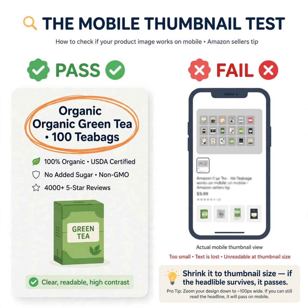
- The thumbnail test. Shrink your infographic to roughly 400 px wide. If the headline isn’t readable, it’s too small. Headlines should survive at thumbnail size; details can require a tap-to-zoom.
- Minimum practical type sizes. At a 2,000 px canvas, keep headlines at or above ~90–110 px and body callouts at or above ~55–65 px. These aren’t Amazon mandates — they’re what remains legible after Amazon’s compression and mobile scaling.
- Contrast is non-negotiable. Light gray text on white, or brand-color text on a busy photo background, disappears on phone screens. Dark text on light grounds, always.
- One focal point per image. Mobile shoppers give each swipe about a second. A single hero visual with one headline beats a collage every time.
- Test on an actual phone. Export, upload to a test listing or preview, and view on a mid-range phone in normal lighting — not your designer’s calibrated monitor. Check both the gallery thumbnail and the zoomed view.
Also consider how images read alongside AI-assisted shopping features — see our guide to Rufus-optimized images.
9 Mistakes That Kill Infographic Performance
- One image trying to say everything. The “kitchen sink” infographic with features, dimensions, warranty, and brand story crammed together. Split it or cut it.
- Desktop-designed type. Text that looked fine at full size on a 27″ monitor and is unreadable on a phone.
- Repeating the bullets instead of proving them. If the infographic just restates bullet points in prettier typography, it adds nothing. Show what words can’t.
- Fake badges and invented awards. Shoppers have seen “#1 Best Seller” graphics on terrible products. Manufactured authority backfires.
- Stock lifestyle scenes where the product is a prop. If a shopper can’t clearly see what they’re buying, the image failed.
- Inconsistent style across slots. Different fonts, colors, and photo treatments in each image make the brand look assembled from parts.
- Designing from your feature list instead of buyer objections. The classic error: leading with what you’re proud of instead of what the shopper fears.
- Unverifiable claims. “Clinically proven,” “50% more effective,” “dentist recommended” — without substantiation, these are compliance risks, not selling points.
- Designing before writing. Starting in Photoshop instead of starting with the headline. The message determines the layout, never the reverse.
Infographics vs. A+ Content: Which Do You Need?
They’re complements, not substitutes. — and the Amazon listing images vs A+ Content question is really about sequencing, not either-or.
Infographics live in the image gallery, reach every shopper immediately, and are available to all sellers. They’re your first investment.
A+ Content lives below the fold in the description area and requires Brand Registry. Amazon’s own materials state that Basic A+ Content can increase sales by up to 8%, and Premium A+ by up to 20% — but note that Amazon publishes no methodology behind these figures, so treat them as directional, not guaranteed. A+ is where you go deeper: brand story, detailed comparison charts across your catalog, video modules.
The practical sequence: get your image gallery (including infographics) right first, then layer A+ Content on top for brand-registered products. An A+ page can’t rescue a gallery that fails the two-second scan test.
DIY or Hire a Designer? An Honest Framework
You don’t always need a professional. Here’s how to decide:
DIY makes sense when: you’re testing a new product with uncertain demand, you have genuine design skill and understand the mobile-legibility rules above, and your category isn’t visually competitive.
Hire a professional when: the product is proven and the listing is underperforming (the ROI math is straightforward), you’re in a visually competitive category (beauty, supplements, electronics) where amateur
creative is an immediate trust signal, you’re launching with real ad spend behind it, or you need consistency
across a catalog of SKUs.
A note on the cost of Amazon listing image design: pricing varies widely with scope, SKU count, and whether creative strategy is included — be wary of anyone quoting a full gallery without asking about your buyer objections and category first. And when deciding how to choose an Amazon design agency, look for objection-first planning, mobile-legibility standards, and a portfolio of real Amazon galleries rather than generic graphic-design samples.
The middle path most sellers overlook: hire a professional for the system — the template, typography, and
objection map — then produce variations in-house. You get professional foundations without paying for every minor update.
If you’d rather hand the whole thing off, our Amazon listing image design service — effectively an Amazon product image optimization service — covers the full process: objection research, gallery planning, and mobile-first infographic design. When you hire an Amazon infographic designer, ask how they handle objection research, gallery planning, and mobile-legibility testing before you look at their portfolio. Browse the portfolio to see the standard applied across categories.
Your Pre-Publish Checklist
Before any infographic goes live, run through this Amazon listing images best practices list:
- Each image answers exactly one buyer objection (state it in one sentence)
- Canvas is 2,000 × 2,000 px, sRGB, exported as JPEG
- Headline is 6–8 words and readable at ~400 px thumbnail width
- Body text meets minimum practical sizes (~55 px+ at full canvas)
- Contrast passes on a phone screen in normal lighting
- Every claim is verifiable or removed
- No fake badges, invented awards, or Amazon-lookalike seals
- Dimensions include a real-world reference, not just numbers
- “What’s in the box” explicitly notes common exclusions
- Style (fonts, colors, photo treatment) is consistent across all slots
- Main image untouched by infographic elements (white background, no text)
- Tested on an actual phone: thumbnail scan + zoomed detail view
The Bottom Line
Amazon product infographic design isn’t a decoration problem — it’s a communication problem. The sellers who win image slots are the ones who treat each slot as an answer to a specific fear, design for the phone screen, follow Amazon’s rules, and prove their claims instead of decorating them.
Start with your reviews and Q&A, map objections to slots, write headlines before you open your design tool, and run the checklist before publishing. Do that consistently, and your gallery stops being a cost center and starts being your best salesperson.
Want a professional read on your current gallery? Whether you need Amazon listing image optimization for an underperforming listing or a full redesign, a free creative audit is the fastest way to find out which slots are costing you sales — we’ll review your image stack against the framework above and show you exactly where the leaks are. See our listing image design service or get in touch to start.
FAQ
What size should Amazon product infographics be?
Build on a 2,000 × 2,000 px square canvas in sRGB and export as JPEG. Amazon requires at least 1,000 px on the longest side to enable zoom; 2,000 px gives shoppers a crisp zoom experience on all devices.
How many infographics should an Amazon listing have?
Fill every available image slot after the main image — most listings support multiple additional images. Give each slot one job (one objection answered). Five focused infographics beat eight cluttered ones.
Can infographics be the main image?
No. Amazon requires the main image to be the product on a pure white background (RGB 255, 255, 255) with no text, logos, or graphics. Infographics belong in the secondary image slots.
Can AI create Amazon infographics?
AI image tools can speed up backgrounds, mockups, and layout drafts, but review every output carefully: AI-generated text is often garbled, product details can be subtly wrong, and inaccurate imagery creates return risk. Use AI for production assistance, not unsupervised publishing.
Should I do infographics or A+ Content first?
Infographics first. They sit in the image gallery where every shopper looks, and they’re available to all sellers. A+ Content (which requires Brand Registry) layers on top for deeper storytelling.
How do I know if my infographics are working?
Brand-registered sellers can A/B test images with Amazon’s Manage Your Experiments tool. Everyone else should watch unit session percentage (conversion rate) and return reasons in Seller Central before and after a gallery update — and give changes at least a few weeks of stable traffic before judging.
One Response