
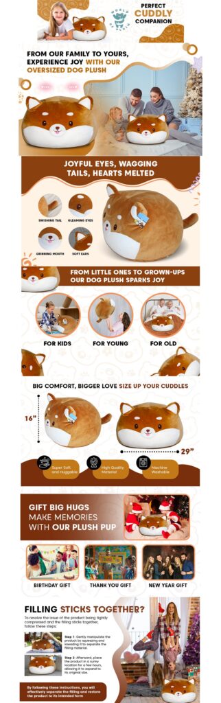
If you have ever typed “amazon a+ content examples” into Google, you know the frustration. You get a pile of screenshots of other brands’ listings and very little explanation of why any of it works. So you do what feels natural: you copy the layout. And then your A+ Content looks fine, sounds fine, and changes nothing about your conversion rate.
I have spent years designing A+ Content for Amazon brands, and I can tell you the secret outright: the listings that sell do not share a layout. They share patterns. Once you see the patterns, you can stop copying examples and start building A+ Content that fits your product and your shopper.
This article walks you through the seven design patterns I see in the highest-performing A+ Content, with plain-English breakdowns of what each one does and how to apply it. These are illustrative patterns drawn from common practice across the marketplace, not copies of any single listing.
First, a Quick Primer: What A+ Content Is
A+ Content is the enhanced content section that appears below the product description on an Amazon listing — rich banners, image-and-text modules, comparison charts, and (for eligible brands) video and interactive modules. It is available to sellers enrolled in Amazon Brand Registry with a Professional selling plan.
Why does it matter so much? Three reasons:
- Real estate. It is the largest branded canvas you control on the product page.
- Objection handling. Your bullets and images do the first pitch; A+ Content answers the follow-up questions that decide the sale.
- Retention. It keeps shoppers inside your brand instead of bouncing back to search results.
Amazon has reported that basic A+ Content can lift sales, with its published figures suggesting meaningful gains — the widely cited number is up to 8% for basic A+ Content, and Premium A+ Content is reported to drive even higher conversion lifts. Treat those as directional, not guaranteed: your lift depends on your category, traffic quality, and — this is the part most sellers skip — the actual design.
What the Best A+ Content Examples Have in Common
Before we get to the patterns, here is what every high-performing example shares:
- One job per module. Each module answers one question or makes one point. Nothing is crammed.
- Benefit-led headlines. The headline states what the shopper gets, not what the product is.
- Scannable in seconds. A shopper scrolling on a phone should grasp the message without reading a paragraph.
- Objection-driven. The content exists to answer the doubts your reviews and Q&A reveal.
- Visually consistent. Same colors, same typography, same tone across every module.
Hold any example up against that list and you will know within ten seconds whether it was designed to sell or designed to fill space.
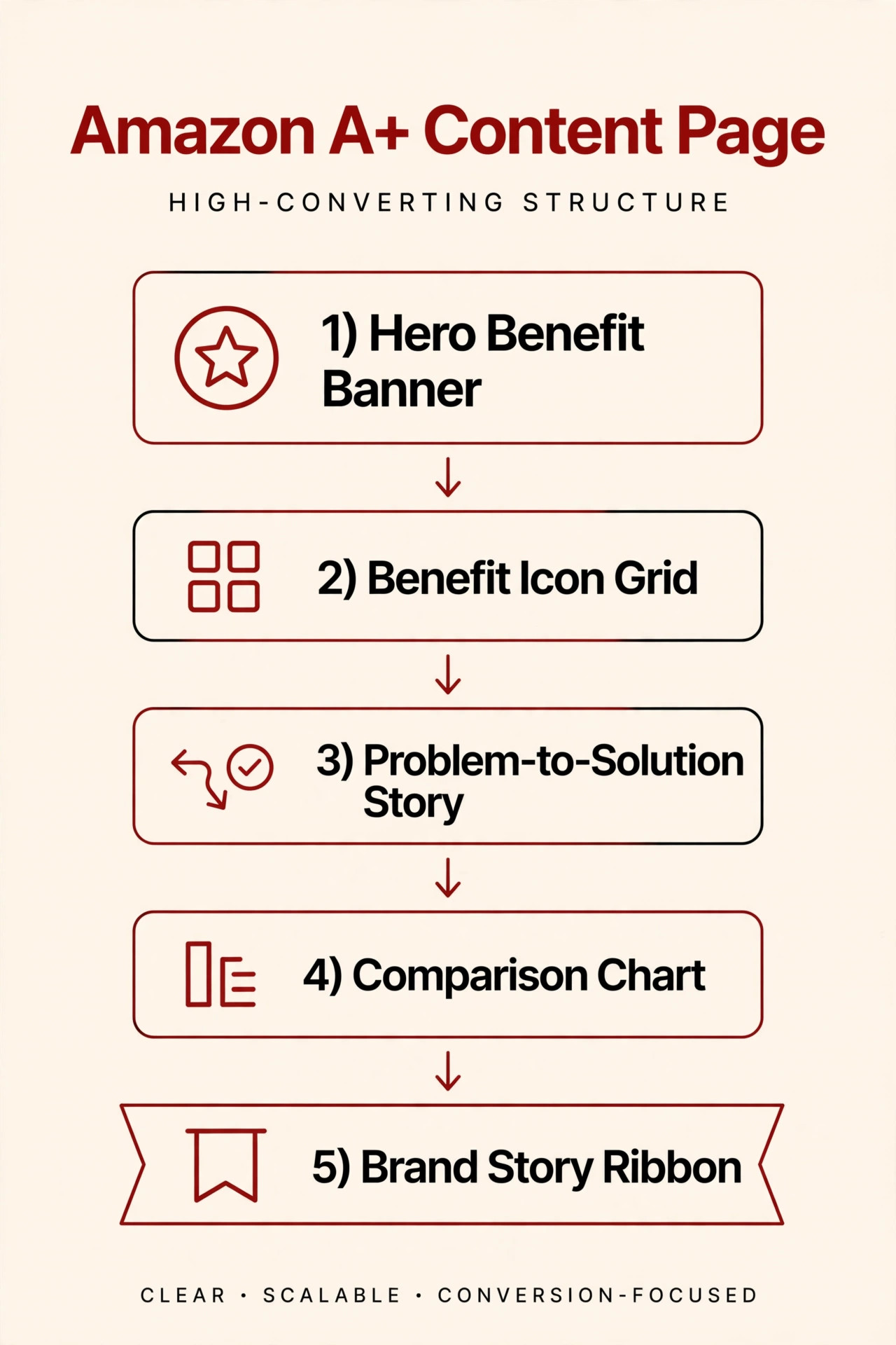
Pattern 1: The Hero Benefit Banner
What it looks like: A full-width opening banner — lifestyle photo or clean product shot, one headline, and at most one short supporting line.
Why it works: A+ Content sits below the fold, so most shoppers arrive mid-scroll. The hero banner is your second first impression. One clear promise (“Wake up without the alarm grogginess,” not “Our advanced sleep formula”) reframes everything below it.
How I apply it: I write the headline as the single biggest outcome your reviews mention. If reviewers keep saying “my kitchen finally stays organized,” that is the headline — not “premium stainless steel organizer.” The supporting line carries the proof: a stat, a spec, or a use-case detail.
Pattern 2: The Benefit Icon Grid
What it looks like: Three to six icons in a row or grid, each with a short benefit headline and one line of explanation.
Why it works: Shoppers skim. Icons turn a wall of features into a menu they can scan in five seconds. This is also one of the most mobile-friendly modules you can build — it holds up at phone width without shrinking into illegibility.
How I apply it: Each icon earns its place by mapping to a real shopper concern: “Dishwasher safe,” “Fits standard cabinets,” “No tools needed.” I never use an icon for a generic claim like “high quality.” If the icon does not answer a question or kill an objection, it gets cut.
Pattern 3: The Problem → Solution Narrative
What it looks like: Two or three panels in sequence — the frustration, the product in use, the outcome. Think: cluttered countertop → organizer in action → calm, tidy kitchen.
Why it works: It mirrors how people actually buy. Nobody wakes up wanting a product; they wake up wanting a problem gone. Walking the shopper from pain to relief builds an emotional arc that pure feature lists cannot touch. I see this pattern constantly in the best-performing home, kitchen, and organization examples.
How I apply it: I pull the “before” straight from one-star reviews and competitor complaints, and the “after” from five-star reviews. When your narrative uses your shoppers’ own words, it lands harder than any marketing copy.
Pattern 4: The Comparison Chart
What it looks like: A side-by-side table of three to five products — usually your own lineup — with checkmarks, key specs, and ratings.
Why it works: This is the quietest sales machine in A+ Content. A shopper comparing your products against competitors in search results might leave your page. A shopper comparing within your brand family stays on your page and often upgrades to a higher-priced model. Use checkmarks and icons instead of dense text, limit it to three to five products, and let your bestseller stand out through positioning or subtle visual emphasis.
How I apply it: I build the chart around the decision the shopper is actually stuck on — size, power, or bundle tier — not around your internal product codes. And I keep it honest: if a cheaper model genuinely suits a simpler need, say so. That honesty converts the bigger sale more often than you would expect.
Pattern 5: Lifestyle-in-Context Imagery
What it looks like: The product photographed or rendered in a real environment — in a hand, on a desk, at the gym, in a styled room — rather than floating on white.
Why it works: It answers two questions at once: “What does this look like in my life?” and “Is this for someone like me?” That double answer does more for confidence than any paragraph of copy, and confident shoppers return fewer products.
How I apply it: I match the lifestyle to the aspiration, not just the use case. A coffee scale is not photographed on a lab bench; it is photographed in a sunlit kitchen next to a pour-over setup, because the buyer is buying the ritual. Match the scene to the identity your buyer wants.
Pattern 6: The Tech Close-Up (Specs as Story)
What it looks like: Exploded views, macro close-ups, annotated callouts — the engineering of the product made visual. In Premium A+ Content, this becomes interactive hotspots shoppers can explore.
Why it works: Technical products stall when the shopper cannot verify quality from photos. A close-up of stitching, a cutaway of layers, or a callout on a hinge turns invisible quality into visible proof. This is where specs stop being boring and start being persuasive.
How I apply it: I pick the three details that differentiate the product from the cheapest competitor and make each one a visual moment. “Triple-stitched seams,” “food-grade silicone,” “aircraft-grade aluminum” — claims shoppers have heard a hundred times become believable when they can see them.

Pattern 7: The Brand Story Ribbon
What it looks like: A closing module with your mission, your origin, or your values — a founder photo, a behind-the-scenes shot, a short statement of why the brand exists.
Why it works: By the bottom of the page, the shopper is nearly decided. The brand story is the nudge from “this product works” to “I want to buy from these people.” It is also the module that sells your next product: shoppers who connect with the brand come back to your storefront.
How I apply it: Keep it short and specific. “Founded in 2019 to make kitchen tools that outlast trends” beats “we are passionate about quality” every time. One concrete detail — a year, a place, a problem you set out to solve — does the whole job.
Basic A+ vs. Premium A+: Which Modules Sell Best
Premium A+ Content unlocks richer modules — video, interactive hotspots, shoppable comparison tables with add-to-cart buttons, and full-width carousels. If you are eligible (it generally requires completed Brand Stories, a history of approved submissions, and strong account health — check Seller Central for current criteria), here is how I think about the module menu:
| Module | Best for | Why it sells |
|---|---|---|
| Premium comparison table | Catalogs with 3+ products | Shoppable with add-to-cart; keeps buyers in your ecosystem |
| Full video | Complex or demo-driven products | Shows the product working; shortens the trust gap |
| Interactive hotspots | Tech/feature-dense products | Lets shoppers explore details without clutter |
| Clickable Q&A | Products with common pre-purchase questions | Kills the exact objections that block checkout |
| Standard image + text | Every product | Reliable, scannable, mobile-friendly foundation |
| Single image with specs | Technical products | Clean home for dimensions, materials, compatibility |
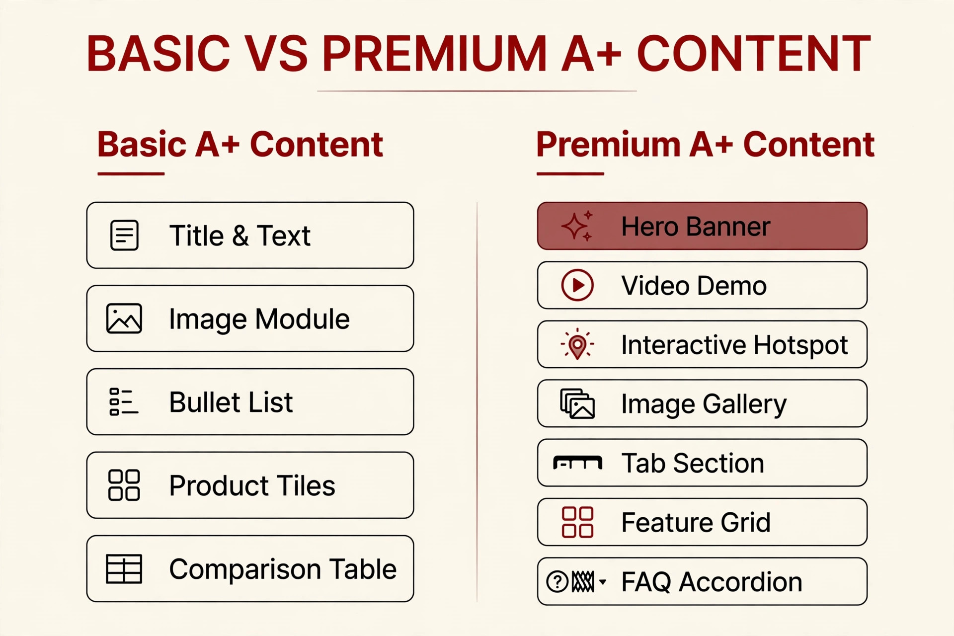
A note on eligibility: Premium A+ is not available to every brand, and the criteria change. Do not build your whole strategy around modules you cannot access yet — the seven patterns above work in Basic A+ Content too.
Design Rules I Follow on Every A+ Project
These are the non-negotiables I apply regardless of category:
- One message per module. If a module needs two headlines, it needs to be two modules.
- Design mobile-first. Most of your shoppers are on phones. If text baked into an image is unreadable at phone width, rewrite it shorter or move it into the module’s text field.
- Headlines carry benefits; body text carries proof. The headline says what you get, the copy underneath proves it.
- Write real alt text. Every image allows descriptive alt text — use it naturally with relevant terms. It supports accessibility and helps search engines understand the content. Do not stuff it with keywords.
- Respect character limits. Modules cap text at a few hundred characters. Shorter almost always wins — a tight 150-character block beats a padded 400-character one.
- Stay inside policy. Amazon rejects A+ Content for warranty or guarantee language, unverified claims, reviews or testimonials, and links or references to outside sites. Design with those rules in mind and you will avoid the rejection-resubmit cycle that delays launches.
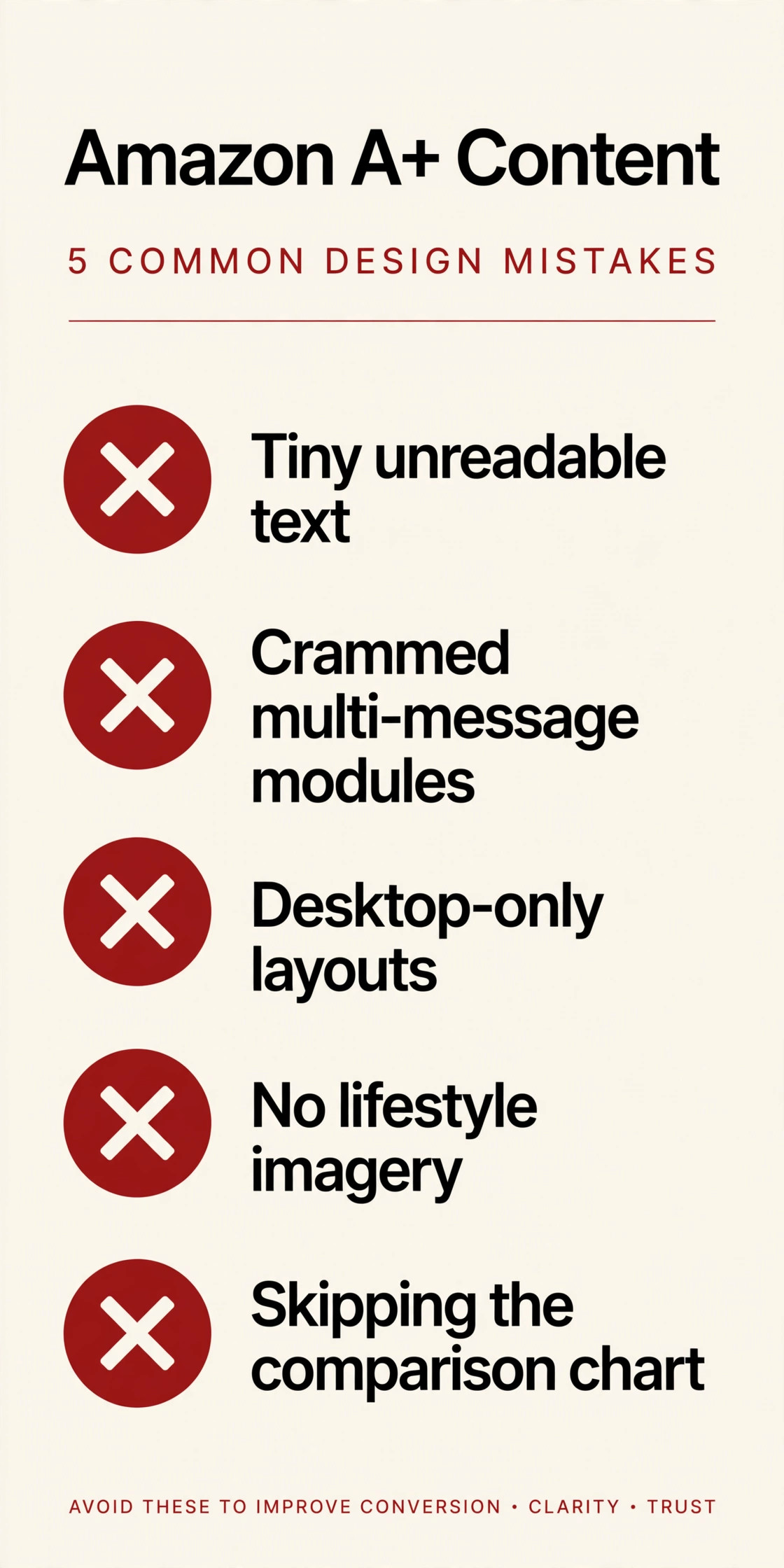
5 A+ Content Design Mistakes That Kill Conversions
I review a lot of A+ Content, and the same mistakes appear again and again:
- Tiny text baked into images. Designed on a 27-inch monitor, unreadable on a phone. If it cannot be read at mobile size, it does not exist.
- Crammed multi-message modules. Five benefits in one banner means zero benefits land. Split them.
- Desktop-only thinking. Dense tables and wide layouts collapse on mobile. Test every module at phone width.
- No lifestyle imagery. All product, no context. Shoppers cannot picture ownership, so they hesitate.
- Skipping the comparison chart. Without it, your comparison shoppers leave your page to compare elsewhere — often to a competitor.
How I Turn These Patterns Into A+ Content
When I build A+ Content for a client, the process looks like this:
- Mine objections. I read the product’s reviews, the Q&A, and the top competitors’ negative reviews. Every repeated doubt becomes a candidate module.
- Map one objection per module. Each module gets a job: kill one doubt, prove one claim, or answer one question.
- Write benefit-first headlines. I draft the headlines before touching design. If the headlines alone sell the product, the layout is just delivery.
- Design mobile-first, then check desktop. I preview every module at phone width. What survives there survives everywhere.
- Submit clean, then test. I keep copy within policy to avoid rejections, and once live, I treat high-traffic listings as candidates for A/B testing different module orders and headlines.
Frequently Asked Questions
What is Amazon A+ Content?
Enhanced product page content — rich images, banners, comparison charts, and videos — available to Brand Registry sellers with a Professional selling plan. It appears below the standard product description.
Do I need Premium A+ Content?
Not necessarily. The patterns in this article work in Basic A+ Content. Premium adds video, interactive hotspots, and shoppable comparison tables — powerful for complex products and large catalogs, but only if you meet the eligibility criteria.
How long does A+ Content approval take?
Amazon reviews every submission before it goes live. Build a few business days of buffer into your launch timeline, and keep copy within policy to avoid rejection delays.
Can my A+ Content link to my website?
No. Amazon prohibits links and references to outside sites in A+ Content, along with warranty/guarantee language, unverified claims, and reviews or testimonials.
The Takeaway
Stop collecting screenshots and start collecting patterns. A hero benefit banner, a scannable icon grid, a problem-to-solution arc, a comparison chart that keeps shoppers in your family, lifestyle context, visual proof of quality, and a brand story to close — that is the anatomy of A+ Content that sells, whatever you are selling.
If you would rather have these patterns built for your listing than build them yourself, I design A+ Content that follows exactly this playbook. One conversation, and I will tell you honestly whether your listing needs a full rebuild or just a sharper module order.
One Response